
Reminder + Simplicity = Lower User Churn Rates.
People need to be reminded about your product’s value delivery package.
Let’s turn around and look at other industries. Cars do that. If you’re buying on brand, you will see the Bentley logo placed around more often and in a higher quality environment than in a lower-priced car. Brand is one of the reasons Bentley buyers pay for the car and this aspect of the overall product is reminded to them — the entertainment/social status aspect.

Having a look at the fashion industry can reveal something relevant as well. There’s a reason why few of the top designer houses release a certain item. The blank t shirts with no logo placed anywhere but which still costs hundreds. It’s a less demanded niche.
Less people want to pay that much and not be reminded about the brand.
I’ve taken these two examples as they are both products that remind about the “virtual” values — brand, social status etc. Now, if this kind of value needs to be reminded, it’s pretty safe to say that when we’re talking about utilitarian value (which is what a SaaS mainly offers), it’s even more important.
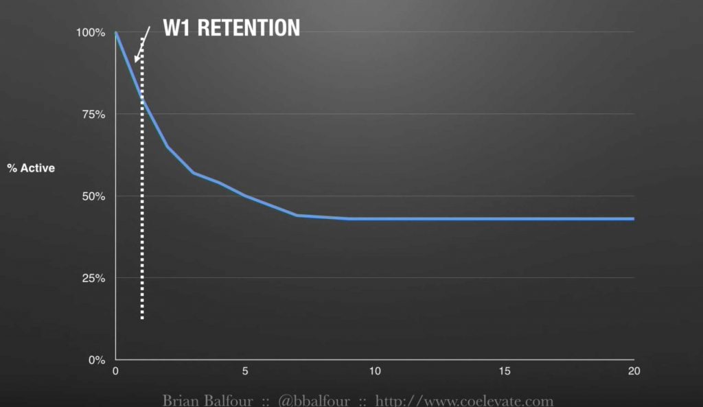
Here’s how stats look in green at a normal level, and then you can notice the overall change in the blue line — that’s what happens once retention in week 1 is enhanced.
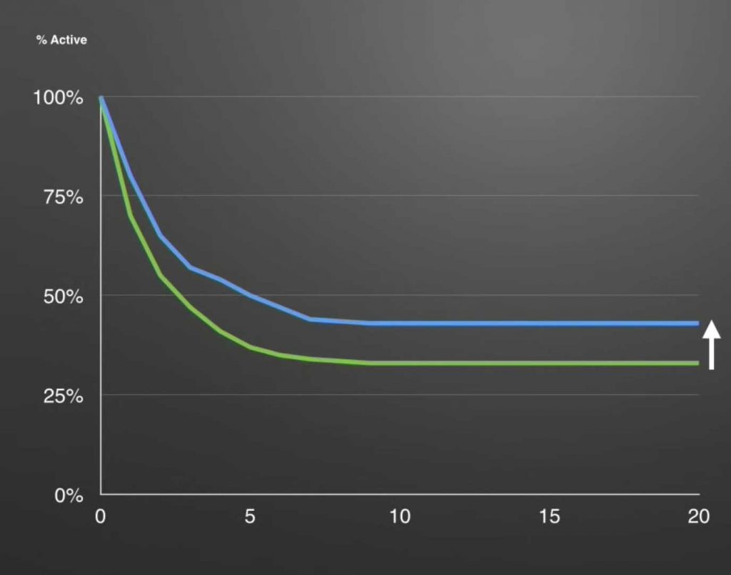
So curiously enough, by working on reminding a user about the value delivery in week 1, the overall impact and adoption rate is increased generally.
What does that mean?
It means, once again, that if you can do something as simple as possible, go that route.
What does simplicity have to do with week 1 retention? I myself have worked with SaaS people for some time and noticed this tendency to over-deliver, scaring the user away rather than attracting her, so I feel like explaining this a bit.
The reason why a “minimalist trend” is around in these years is not
Rather it’s because we’re all surrounded by so much information, therefore so many options, and it helps if we have one less thing to worry about.
Simple, simple, simple — and then even simpler.
Think about the years ahead — we’ll need something even better than a minimalist trend to filter through the oceans of information we’ll all be submerged into.
Yes, I know, it’s within the nature of engineers/data-oriented/technical people to add as much as possible because heck — you want options. But you’re working 5 days a week (at least) on the same product, interacting with it every day. The end user? They’ll see it for the first time. And when they do that, they obviously don’t have the same level of experience with the product as you do.
That’s why I wanted to touch on simplicity: it’s the key to the “enhancing the week 1 experience so users can stick around for longer” concept
What does simplicity mean? It means they want to be taken by the hand. You want that as well with so many things — you want to read about how a remote works. You see the big red button and test it without thinking.
Only then, after going through the simplicity of a process, you would worry about the plethora of options that you get access to later — customisation, they call it. In the remote example, it would mean having a look at the other buttons.
But until we get to customisation, let’s remind the user quickly enough why they use your product. Be it a notification, an email, or a big red button — whatever it takes to redirect the attention towards something that’s valuable. Click the red button and see the product being brought to life — that’s a reminder, possibly.
Here’s an example of what I’m saying
I’m being reminded about the value delivery on the left side of the screen, while on the right side I’m being taken by the hand and shown the way.
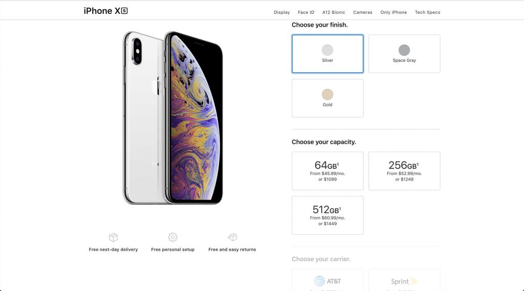
Yes, the iPhone is a fairly complex product much like your SaaS — but Apple managed somehow to bring it down to the simplest possible way of dealing with the purchase process.
Want to give your user the power to customise more than the simple 5-step process? Sure, give them the chance to knock themselves out customising — at the end of the “simplified” road.
The bottom line
Reminder + Simplicity = Lower User Churn Rates.
The “reminder” part means shoving in your user’s face what the product does for them in the first week of usage, so they can stick for longer.
The “simplicity” part means making sure that this reminder is being conveyed properly and understood by them.
About Ch Daniel
I run Chagency_, an experiences design agency that specialises on helping tech CEOs reduce user churn. We believe experiences are not only the reason why users choose not to leave but also what generates word of mouth. We’re building a credo around this belief.
If I’ve brought you any kind of value, follow me and get in touch here: LinkedIn | Twitter | Email | Quora | YouTube (same content but in video)
I’ve also created an infinitely-valuable app for sneaker/fashion enthusiasts called Legit Check that impacted hundreds of thousands over millions of times – check it out at chdaniel.com/app
Please share this with someone and subscribe to our newsletter!— helps us keep pumping content?