Elegant simplicity is a fine line. A very thin thread. A balance to be found. ES is the answer that yields infinitely better results and at the same time it’s a few centimetres away from nothing or too much.
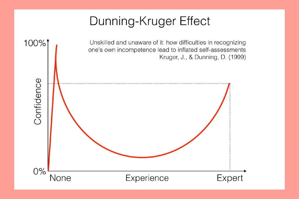
That’s a lot on conceptual talk, let’s get to real. There are these two guys called David Dunning and Justin Kruger. Smart guys and if you’ve dabbed a bit into psychology maybe you’ve heard of this thing they came out with called the Dunning-Krueger effect.
In short, what they say is that in the beginning one is confident as their experience-knowledge levels are low. As these levels advance, confidence diminishes to hit rock bottom, after which it starts growing again. At least that’s what I got – have a look as well if it doesn’t make sense, maybe you’re more confident/experienced/knowledgeable than me.
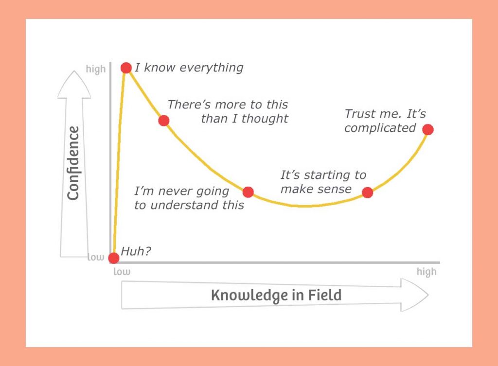
If that’s too complicated, here’s two visual representations of their effect
What does that have to do with the title?
In a sense, it’s the Ying-Yang. And before you deem me as being high while I write this, I think both are good parallels to simplicity. Let me draw it for you:
Say you’re redesigning the onboarding experience for your users. You start with nothing and have an idea. It’s a good base but it’s simple. It lacks many things – that’s the first peak. So then you start adding features, images and what not. It goes to a point where it’s bloated. And here’s the big difference:
- Most people stop here and say “That’s it, it’s got everything it needs!”, calling it done and going home with a bloated project.
- Very few start removing and optimising so as to end up with an elegant result.
If you’re in the second case (a direction which is one of
That, my friends, is what elegant simplicity is. Starting with an elegant concept, adding and then (which is what most forget) — reducing. We are hoarders by nature and it’s against our biological hardwiring to do so.
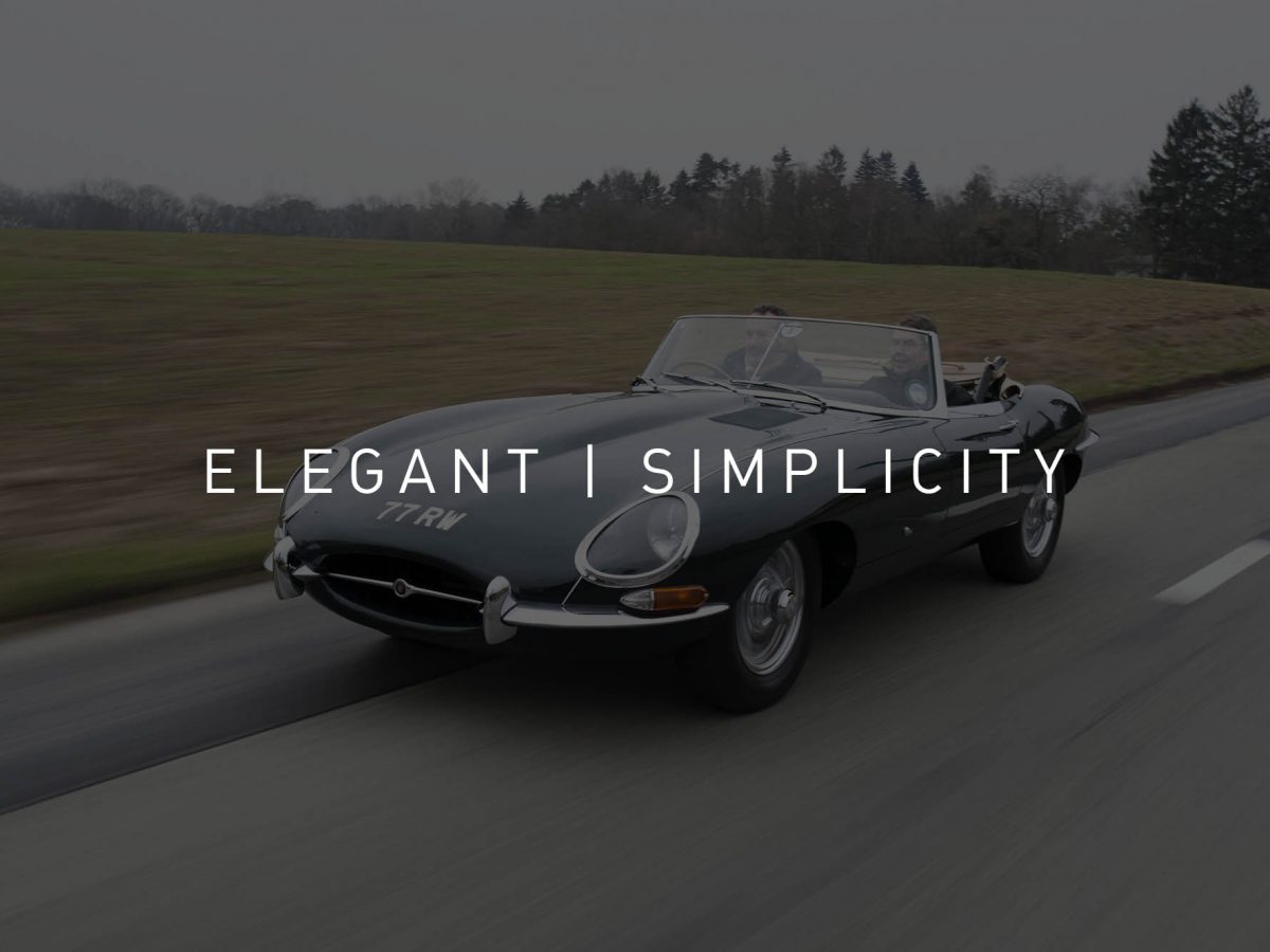
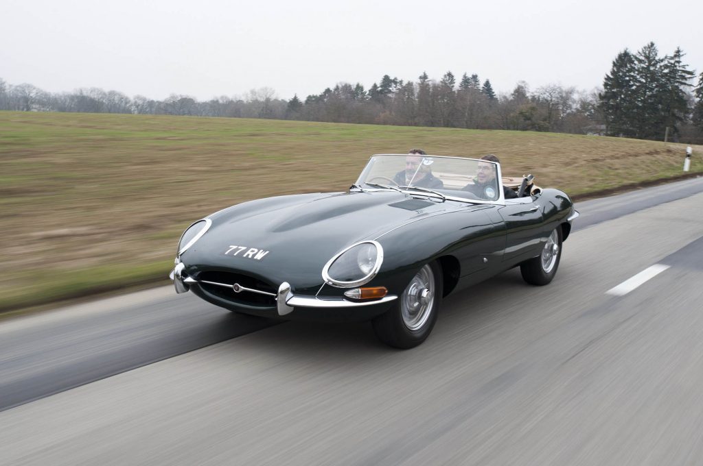
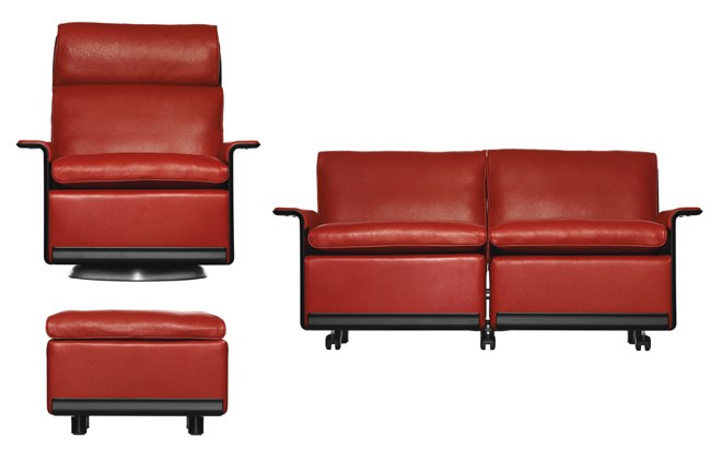
But it is also what we appreciate in life and what makes us say “that was so good and so easy” – Amazon Prime, the Tesla Model 3 interior, the 1961 Jaguar E-Type, most of Dieter


It’s a matter of finding the right balance between how special something can be while still uncomplicated. And for that you need to conquer both summits described above.
How simple can we design this experience for our tech product while not going into becoming too generic? And for that you need to conquer both summits described above.
The shorter version: bad is too generic while bad is also too complicated.
How’s your product’s experience?
About Ch Daniel
I run chagency, an experiences design agency that specialises on helping tech CEOs reduce user churn. We believe experiences are not only the reason why users choose not to leave but also what generates word of mouth. We’re building a credo around this belief.
I’ve also created an infinitely-valuable app for sneaker/fashion enthusiasts called Legit Check that impacted hundreds of thousands over millions of times – check it out at chdaniel.com/app
Please share this with someone and subscribe to our newsletter!— helps us keep pumping content?