
Today is about searches. A bit of design and a bit of philosophy.
When searching for something, you’d rather have your room clean rather than messy. If everything is put into place:
1) You’ll know where what you’re searching for might be
2) There won’t be things in your way that will slow you down (this is how it’d be in a messy room)
3) Your mind is not cluttered by so much random information (i.e. random things on the floor and in the room)
There’s this fundamental concept of mine which I wrote about and for which I dedicated an entire category on my blog.
It’s called elegant simplicity. It’s not rocket science, I’m not one to invent a new physics model like Einstein and every average Joe can be cynical and say “you can’t coin that — everyone knows it”. However, just like you, dear reader, I know that you don’t have to be the first when it comes to creating something (not all the time, at least), you have to be the voice that creates the most around a concept.
See: Facebook and MySpace. I know you, dear reader, like to create stuff and chances are you’ve founded your own company. If this article gets distributed to the right hands (screens), you’re the founder of a tech company.
I’ll finish this digression by saying something that might inspire one or two people, if they’ve got at least a tiny bit of competition. You know it already: there’s always enough space for you to outrun a competitor, even if you’re not the first to create it.
Now back to the subject.
Back to searches. We were working on the user flow of an app the other day — as part of a project we’ve been hired to do. The client/partner was asking if it’d be wise to add some extra information on the main search screen.
The answer was a clear no. It’s easier to grasp why I drew the messy/clean room parallel in the beginning of the article and connect it to the clear no.
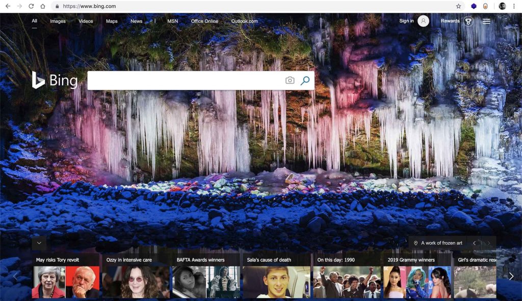
And hey, don’t listen to me. Listen to the +$750B company
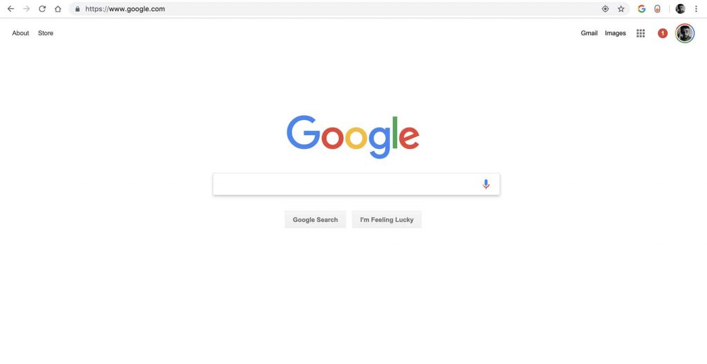
I don’t want to trash talk Microsoft and Bing but I’ll just leave this here — you draw your conclusions.
Here’s another concept of mine that needs an article in itself.
When it comes to design, it’s okay to have a mess as long as you need to go through something orderly in order to get there.
Practical examples:
- Cabinets in the kitchen. All my spices are not from the same company, thus their packaging is different. As much as that keeps me up at night (no joke), I managed to accept it. Why? There’s a big piece of wood that prevents me from seeing them every day.
- A laundry basket. Dirty clothes and whatnot. You don’t want to see them daily so you put them in their special place that has to be not transparent
- Your phone. The mess of apps (I’m aware 99% don’t care about this, I don’t either. Very few do) is revealed only after unlocking. Are they on the lock screen lately?
- Complicated
watchestimepieces. Some of them are minimalist and clean,though “under the hood” the micro-precision and complexity levels are from another world
- That electricity panel in your house? Not only you don’t want to see it daily,
you don’t want access to it — you, your kids or whoever’s visiting. - Your fridge. Same as before, you don’t want to have the smell invading your nostrils every second
“Ok Daniel cool. What are you saying though?”
What I’m saying is this: when you’re searching for something, there’s some uncertainty. You don’t know whether you can find it or not. If there’s mess (just like the room), you’ll be discouraged.
You need to facilitate the consumer’s search as much as possible. That doesn’t mean it has to be slate clean and simple like Google. But the simpler, the better. Here’s how our project turned out (the one I mentioned earlier)
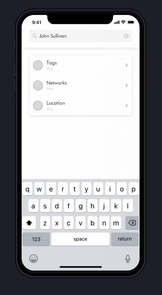
Elegant and simple — nothing more than what’s needed. I chose to disclose just the wireframe stage, not the final version. That means no colours and instead of the circles, there are icons attached to the clickable options.
If there would be a huge mess within the first search screen — that’s when you risk scaring someone who’s already in a doubtful position. By having this orderly manner of searching you indirectly:
- take them by the hand
- show them it’s not that hard (orderly search)
- they get a bit of confidence because they’re answering with whatever they know at that moment (I’m looking for pizza places — I know that so I can input that)
And it is at that moment when the mess can be revealed. Simply because they did something that was easy for them. Therefore, the experience has started with something that’s not difficult
This may look like…
… we’re microanalysing a lot of irrelevant stuff. It is not. It might seem clear to us now because we’ve been used to it for so long. But that’s only because we’ve been spoiled with it — and we know how much we’re tending to take things for granted.
However, the concept can be applied to business cases. Are you scaring users before they’ve even done something simple?
Do you make it easy for them to start engaging?
The reason why Google’s main page has been elegantly simple for such a long time is not a coincidence. Under the hood, you can go on advanced search and it looks like this
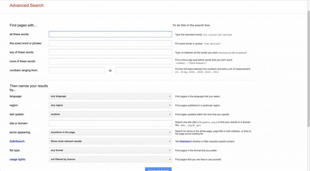
Still elegantly simple, I’d say — as much as it could be. That is, though, the continuous refinement over years and years.
I can ever go as far as pointing out that digital search systems require “consentful control” — but it’d be a stretch because it’s already a standard.
The conclusion
Dear reader, I’ll restate. You can have
That is an example of elegant simplicity and in consequence, it became a standard when it comes to digital search.
About Ch Daniel
I run chagency, an experiences design agency that specialises on helping tech CEOs reduce user churn. We believe experiences are not only the reason why users choose not to leave but also what generates word of mouth. We’re building a credo around this belief.
If I’ve brought you any kind of value, follow me and get in touch here: LinkedIn | Twitter | Email | Quora | YouTube (same content but in video)
I’ve also created an infinitely-valuable app for sneaker/fashion enthusiasts called Legit Check that impacted hundreds of thousands over millions of times – check it out at chdaniel.com/app
Please share this with someone and subscribe to our newsletter!— helps us keep pumping content?
Illustration Credits: Alberto Seveso, Tea Jurisic

Amir
February 13, 2019 at 4:53 am
So elegant, I’ve been dealing with some similar issues where I’m not sure if a form or a Searchbox makes sense.
Your design gave me some inspiration.
Ch Daniel
February 13, 2019 at 11:35 am
Glad to have helped! Reach out to me at [email protected] — tell me more about what you do