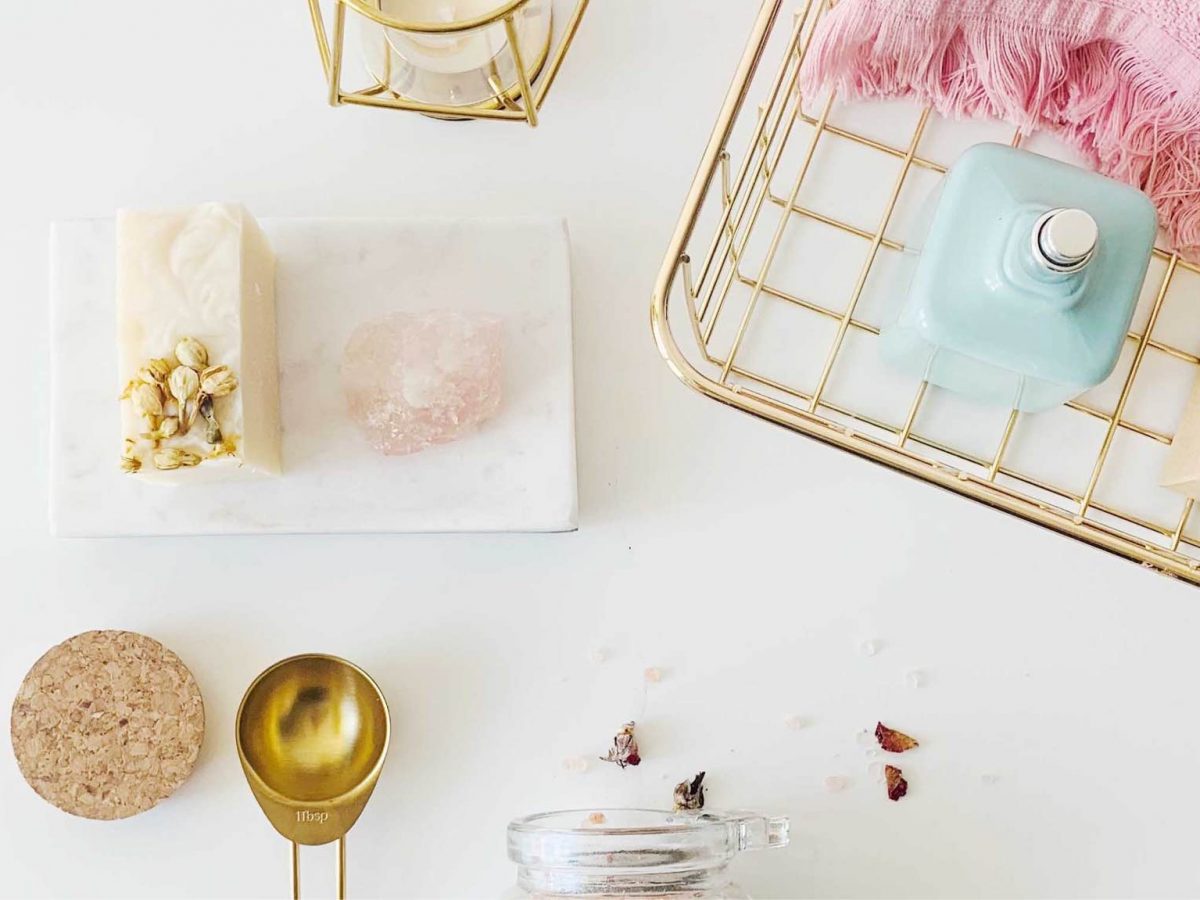
If you go to the soap aisle in your supermarket, you’ll notice a certain type of product: a soap that’s maybe the second/third/fourth cheapest but which tries to look upscale.
It’s interesting since these days, upscale soaps these days look bio, natural and eco-friendly. That’s a mission-driven product.
Nonetheless, I said “tries” to look upscale. Here’s what happened.
A couple of years ago, it indeed looked upscale — probably for that period of time. For 2015 or 2016, the packaging looked like it was more… luxury. And then you’d see the price.
“Oh that seems to be cheaper than I expected” — one might say. In fact, after closely analysing, you’d see it’s £1 or £2 extra on top of the cheapest option.
That’s an interesting case study in itself, how either Baylis & Harding done that or even Dove. They’re the most sold soaps.
Time goes by and now it’s 2019. The packaging still looks interesting but another question comes through: why don’t they just update the packaging to the latest “luxury”-lookalike visual direction?
And the answer is this: the cost of doing that is too high. Not the financial cost, but the cost of familiarity.
People have gotten used to the way it looks and the more time goes on, the easier it is to get accustomed to it.
In a sense, if it’s not broken then it doesn’t need fixing.
What’s the bottom line then?
I’m trying to draw attention to the fact that good design needs to be planned. I don’t know exactly when these visual directions were adopted but surely they haven’t been changed in the last few years.
That is what good design is, regardless of whether it’s “beautiful” or not: something that works and stands the test of time.
It’s what I’ve explained in the discussion about a SaaS company’s logo over here. You could say Uber’s previous visual identities were not good since they had to be changed.
The current one? I think it will stand the test of time and it does a good job at showing what they are about.
In conclusion, if you’re going to have anything that’s closely resembling a strategy (which you will) when implementing any new design, it’s worth considering the soap example above and the test of time.
About Ch Daniel
I’ve updated this signature in July 2020, so older mentions of the signature might not make sense.
I currently don’t write on this blog anymore. I wrote daily for 9 months on this very blog, but now I’m focused on building the CH Group.
If you want to follow my newer articles, check out the CH Group’s blog.
See everything I do here: Chdaniel.com


