SaaS logos are… obviously from the tech world. Therefore SaaS CEOs imagine their company’s logo has to be “in line” with the trends of the tech industry.
That’s not a wrong thing to think, as long as we are aware of a common mistake. And look, when debating SaaS logos below, I won’t be judging aesthetics or superficial traits.
No, I’ll be looking to save you anywhere between $500,000 and $50,000,000 in a few years. Maybe even more.
How SaaS logos should be
The thought process behind a SaaS logo
Less:
- flashy
- trendy
- me-oriented
- with a special “catch”
And more:
- perennial
- elegant in a simplistic manner
- versatile
- if possible, immortal.
You’re running a tech company and you want your SaaS logo to show it, I get it.
You may want to show it to your friends and have them say “Wow, that’s a slick logo!” – totally understandable.
Moreover, it’s also possible that you want it to have that “special something”, something that will show “different” but at the same time smart.
Maybe pointing to 3 different things at the same time? Like a car …. but in fact a… tree? But also a cloud…! Cloud computing! Yes, that’s what we do! So it HAS to have a cloud!!
I’ll stop here. The helpless dialogue can go on and on. It’s drifting into a thousand directions with no outcome.
Why this article can save you $50,000,000
I’ll go ahead and explain the wrong (or rather “costly”) elements that a SaaS logo can have, and the good, long-term test that a SaaS logo should pass.
I’ll start with the wrong directions so we can finish on a high note.
If you want the short version though, it’s a matter of going as long-term as possible. Sometimes, designers are enabling a lot of the mistakes described below. That happens especially when free rein is given.
Don’t get me wrong, part of what we do is design as well — giving them free rein is absolutely the way to go. In some cases, it can go wrong.
And that’s exactly what this written piece is for: give the designers free rein, while keeping in mind these tests/directions. If you’re aware of them, then everything will be good.
So why can a bad SaaS logo cost as much as 8 or 9 digits? Easy: do any of these mistakes below and you’ll have to redo it. And redoing it means everything has to be reprinted, refitted, reshaped, revamped or reconditioned.
A small little pen — you can skip that. But a physical location’s forefront: that can’t be “skipped”.
Imagine the cost of fixing everything if the SaaS logo goes wrong. But hey, you don’t have to — if you follow the guidelines listed below.
The wrong directions of a SaaS logo
Logos that respect a current trend
Just like the expiration date article, if you (or the people you’re hiring) are looking to follow design trends, that’s not bad.
But it can be horrific.
In the worst case scenario, you shall be ready to open your company’s wallet again in a couple of months/years — that’s the price you’ve got to pay for following trends.
In the best case scenario, you will get some inspiration from the trends and use that pretty much as a driving (but not leading) factor of the visual direction of your company’s visual identity.
For instance, you might have noticed how in the last years, the retro 50s/60s “diner menu” font comes back in style every now and then.
A SaaS resource we’ve generated for our SaaS people is “Get Startup Funding” — a place where we’ve gathered the exact pitch decks that companies like Dropbox/Uber/Airbnb used to raise capital.
In there, we sometimes also add how these companies’ website looked like in the early days. Have a look at WeWork’s VC deck page and you’ll see how in 2013 their website resembled the exact 50s/60s restaurant menu font we’ve talked about earlier.
Bottom line: Become aware of trends? Yes. Follow them trying to fit in? Hell no. If you do it, you’ll have to redo it in 2 years.
Abstract twisted 3D shapes.
It looks cool, I’m not going to lie — especially for a SaaS logo. But another question arises when you adopt an abstract/twisted 3D shape as a logo: how are you going to print it?
I’ve had this challenge when I once wanted to 3D print some cryptocurrencies logos. More specifically, the Zilliqa logo, which looks like this:

It’s meant to create a perspective effect in 2D, which sounds/looks kinda interesting.
The consequence? It can’t be printed easily in 3D (which is becoming more and more prevalent) — unless you want to reconstruct it, which takes some time.
It was simply easier to not print it at all. I don’t know any SaaS company who would want to be in that situation.
Bottom line: do you want your SaaS company to only exist for a couple of years and only in the virtual? It’s ok, then, to do this.
Do you want your SaaS to become a real company that will have to have its logo on a variety of things like:
- a pen
- a huge billboard ad
- a letterhead
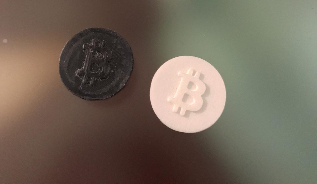
- a 3D printed coin
- a pin badge
And everything in between? Have this in mind.
Litmus test: if it would be so that people would become fanatics for your company, can they have your SaaS logo tattooed on themselves?
A stretch, I know, but think about it.
Below is an example from those 3D printed cryptocurrencies logos. More on this a bit later.

SaaS logos with gradients
Another cool thing. And with the right background, these SaaS logos are even more likely to get one’s attention.
But what happens when the printer is out of colour ink and your letterhead’s logo is in black and white. Can people still tell it’s your company or is it game over?
For instance this SaaS logo.

Coloured? Yeah, slick.
Black and white?

Who are you, again?
Litmus test: Does your logo look good in black and white?
The bottom line here is that it’s perfectly fine to have a gradiented SaaS logo with one caveat.
And that caveat is: make sure your SaaS logo does not depend on having the gradient visible in order to distinguish it.
If one can still understand it’s you when there’s no colour/gradient — that’s the right one.
A logo with multiple micro details
Remember the 3D printed cryptocurrencies logos? One of those that we actually printed (i.e. not skipped like Zilliqa) was Cardano. This is their logo:

And this is how the 3D print turned out.

That wasn’t the final version. We had to go on a more precise level, because it was not distinguishable. And then it turned out like this:

It turned out to be fine at high-precision level but ideally you don’t have to go there. And the smaller circle are imprecise in some cases.
Can a 5 year old draw it?
Or can you draw it on a piece of paper without needing a plethora of tools to make sure you don’t end up with a bunch of circles arranged like crazy?
Litmus test: can it be doodled?
Below is an example of a SaaS logo which looks nice — but which seems to be too complicated to be doodled.

The right elements of a SaaS logo
Stands the test of time
I’ll give a very very popular example in the world of designers. The Chase logo.

It was designed back in 1961 and it could still operate at full capacity today. In fact, it’s so well engineered that it did fit perfectly as an icon for a mobile app. 1961, still works in 2007 — that’s something to aim for.
Not easy to execute, but aiming at it will keep your SaaS logo on the right path.

Bottom line: if you take your SaaS company seriously, you want it to be there in 20 years.
It’s hard to nail what it will do then, especially if it grows exponentially. But having the long term vision in mind is definitely something that will keep you from short-term mistakes.
A good SaaS logo works for all sizes/preferences
People hate new logos when they come out and everyone and their neighbours are discussing logos.
I think that’s a beautiful thing. If your logo is critiqued, you’ve won as well. It doesn’t have to be loved to be good. You lose if it’s so boring so as to create confusion for your users or not reach a business goal.
Here are 3 reasons why negative judgement over SaaS rebrands don’t make any sense:
- One can’t know what the company is up to. Usually they rebrand or recreate their visual identity because they want to shift to something new or broader (which they don’t have to announce to the public) — so people judge looking at the past and at the current state. Never into the future.
- One doesn’t know a company’s business challenges.
- One doesn’t understand that it’s not simply meant to be pretty. As I always say, pretty is for concepts.
So yes, the F1, Animal Planet or Dropbox rebrands were hated.
Can we, from the outside, know these three points noted above? No. But time will tell whether the revamps did their job.


We all know how we can only connect things when looking backwards. Trying to do that into the future is doable, but 10 times harder.
A side note: SaaS logos are hiding a secret
Here’s one thing to remember: as I said, we can’t know a company’s internal decisions most of the time.
Rebrands and logos are the only clues that are left out there to confirm it.
Every time it happens, a message is coded into it. F1 rebranded into a more modern visual identity because their plans probably include more modern activities. Time will tell us.
Dropbox changed from a “file storage company” to more than that in June 2019.
But their rebranded visual identity was revealed in October 2017. A year and a half in-between — and now we know why.
Sometimes it can take 5 years though.
Do the exact opposite of everything noted above under “wrong”
I can make this article double its size and reiterate the tests I’ve noted in the “wrong” section – but your time is limited.
Aa good logo will pass the hurdles I’ve noted above. I suggest having a second look at the “litmus tests” I’ve put together multiple times whenever there are doubts in regards to a SaaS logo. And maybe even where there aren’t.
P.S: For the logos linked above, there’s not hate towards the creators. Maybe it’s simply a creative exploring her or his ways. This article is strictly for the sake of applying these logos to SaaS companies. I think they look great, as noted before, just hard to be applied.
About Ch Daniel
I’ve updated this signature in July 2020, so older mentions of the signature might not make sense.
I currently don’t write on this blog anymore. I wrote daily for 9 months on this very blog, but now I’m focused on building the CH Group.
If you want to follow my newer articles, check out the CH Group’s blog.
See everything I do here: Chdaniel.com


