This is for people who have read yesterday’s piece and are at an earlier stage through their SaaS company.
As a follow-up to yesterday’s piece, I should add the fact that one shouldn’t leave the post being crippled by the possibility of decisions.
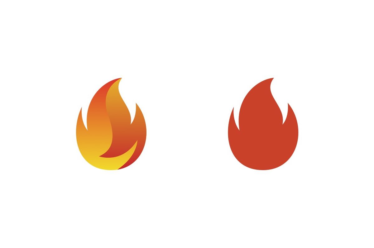
Yes, a wrong logo (again, not visually wrong but technically wrong) will incur a longer bill for you to pay.
But that doesn’t mean things are more or less complicated now. If anything, less complicated, as your logo should be.
Trends come and go. I picked “gradients” as an example because it has been trendy for quite some years. To make that post perennial, just switch “gradients” with whatever is cool in 2034 or whenever the article may be read.
Simplicity, though, is ever-lasting. Yes, I know, you want part of your story (or part of the mission, what I said yesterday) locked somewhere inside that icon. That’s okay.
But that “divine inspiration” doesn’t happen to strike you or whoever you’ve got next to you who might be helping, there are two options:
- Either get help from someone else who’s had experience in doing them — but be careful who you pick here. I wrote a guide for how a SaaS company should pick an agency/freelancer, it’s in my history.
- Go for something simple at the moment and focus on the real problems. Later, you’ll be able to handle it.
About Ch Daniel
I run Chagency_, an experiences design agency — we help SaaS CEOs reduce user churn. I write daily on this topic and in similar areas. Here are my best pieces.
If I’ve helped you, follow me here and reach out: LinkedIn | Twitter | Email | Quora | YouTube
I’ve also founded an app that went 0-200K users in its 1st year — chdaniel.com/app
If you want a more of a personal connection, here’s how to have that.


