When it comes to logos, there’s a culture to every industry/field.
Corporate is usually blue.
Nature/ecological/environmentally-aware companies are… green — no news here.
And it’s not just about colour: agencies tend to have a type-only logo i.e. it’s only text.
They all have their purposes. For instance, agencies have it like that so as to not have the logo take the spotlight — you’d ideally want people focusing on whatever marketing/advertising/branding campaign is presented.
In SaaS though, there are two types of “cultures”. And my strong opinion is that one of them is wrong.
First type is clean, with no complications, maybe some witty-ness somewhere. There’s a catch in the logo: you spend enough time and you’ll discover a piece of the puzzle.
Examples for this type are plenty. Think of most top tech companies and 8/10 at least will be like this. I won’t insist on this category and it’ll make more sense why.
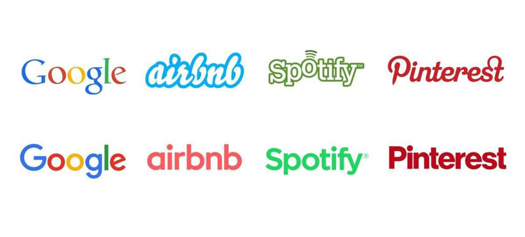
The second type is either with gradients or super-complicated elements.
If your logo needs a gradient to make sense, this is the wrong way to go about it. And bear with me, I’m not here to discuss what’s beautiful and what’s not. I know we’re talking about businesses and you’re not selling art. I’ll be talking about why it costs you more to have something complicated.
I’ll start with an example of my own. Fire as a graphic icon — it makes a lot of sense to use a gradient. It’s not red, it’s not yellow or orange, it’s all of them. I was testing a fire logo and here’s the visual representation
It makes a lot of sense to use the gradient one — from a visual point of view. The red-only one is nowhere close to expressing what its counterpart does. And maybe you don’t like the icon or the red shade. Fine, here’s another one.
Same problems appear again. Bear in mind please that this example with the fire is just something that adds on to the logo visually. Some logos don’t really make sense without gradients or multiple colours because they represent the shadow of an object or what not.
Here’s a comparison of simple vs complicated:
Can someone doodle the one on the left?
The lesson in this case
You want your company to become something big, most probably. Do your thing with the gradiented/complicated logo that looks pretty — but at your own peril.
Yes, I know, the biggest argument against what I’m saying is:
But we now live in a mainly-internet world where we can afford to do this. My logo will be just on the website and in emails.
To that I’ll object that you’ll need to have it on documents and business cards at least.
Here’s my nugget: when the time will come when your company will scale (if you treat yourself seriously enough to aim for that, which you do, I’m sure), you will need to change it.
Changing the logo is not only something that takes time and effort, it’s something that will require money. Not just to pay the designer but to change the little damn icon in every little corner of whatever your company has produced.
Think of it this way:
- Documents — cool, paper printing is cheap. What about the legalised ones?
- Office signage
- All business cards for all employees
- Website and all the afferent apps
- It’ll take a year or so until all the other products that integrate your website will change it (look at Slack today, who’ve just changed their logo in January 2019. A lot of products still use the old one and no wonder why)
- Ads
- Social media icons
- Posters
- Any kind of physical event — booths and what not
- You may have mugs, caps or some other auxiliary items you’ve branded
And the list can go on and on. It’s very likely you won’t get to have all of these if you’ve got the complicated icon as your logo — but your life would surely be easier if you’re in the other boat.
How does a simple one look like?
If possible, it should reflect part of the core mission — cheesy, I know, but hear me out.
Take for example a project we’ve done — Alter. Their product is about getting people’s clothes tailored, and that’s just the initial phase. But if the company lasts for 20 years or longer, their deep fundamental idea is to eliminate the problems around measurements.
The consequence? The logo is not something about the proper fit of a shirt, which is something that can match the company’s outputs in the first years. Then, some years down the line it could become just “the story of how we started”.
No, the logo is showing a measuring tape, because that’s what they are about: measurements. See that “l” detail?
Think not in the long-term, but in the company-lifelong-term. Whatever is there now that will stay — the mission is an example.
How to test your logo
If you want more examples, here’s a screenshot from a website that list companies that have used their product. Can your logo fit in there?

And even more important, here’s how to see if your logo holds water. I purposefully made the image smaller — can you still tell what’s going on there?
That second P in PayPal is not that strong, which proves my point above. You can still tell Microsoft, Square and even Barclays. Mailchimp? Hmm, almost.
The test here is whether the logo works at small sizes and at big sizes
Take for instance this company called Conservation International. On the left side you’ll see their old logo and on the right side you’ll see their new logo
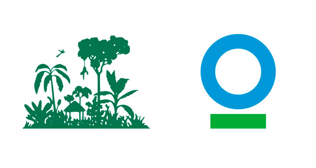
That’s an example of complexity I mentioned above. If I’d tell you they have a partnership with Starbucks, you’ll see why. Here’s the visual representation of their partnership before:
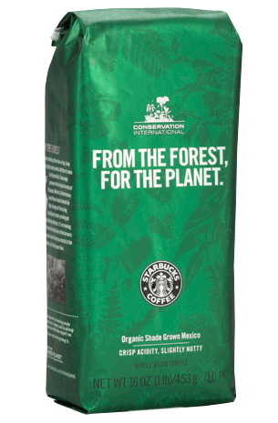
Up there, yes. And here’s after:
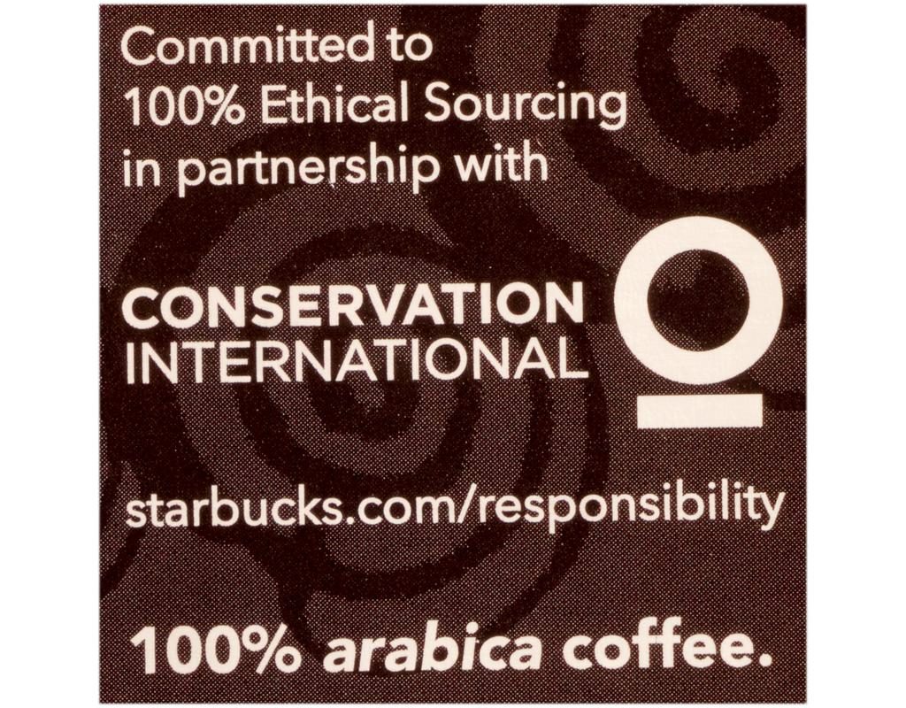
You can tell it’s a close-up and you can also tell how crisp and clear their identity is shown now.
The bottom line
Do your thing with the gradiented/complicated logo that looks pretty — but do so at your own peril.
If you treat your company seriously, there will be a time when you’ll have to change it to something simple.
Something that will work on usage cases as small as coffee packaging product and something that’s very recognizable on a billboard.
So recognizable that people will say “What is this? My 4 year old could’ve come up with this logo” — that criticism is the best kind of compliment a company’s rebranding can ever have.
Because if a 4 year old can doodle it AND she/he gets to love what your company does — there you go, you’ve got a loyal fan for life (plus some free publicity).
About Ch Daniel
I run Chagency_, an experiences design agency — we help SaaS CEOs reduce user churn. I write daily on this topic and in similar areas. Here are my best pieces.
If I’ve helped you, follow me here and reach out: LinkedIn | Twitter | Email | Quora | YouTube
I’ve also founded an app that went 0-200K users in its 1st year — chdaniel.com/app
If you want a more of a personal connection, here’s how to have that.