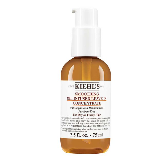
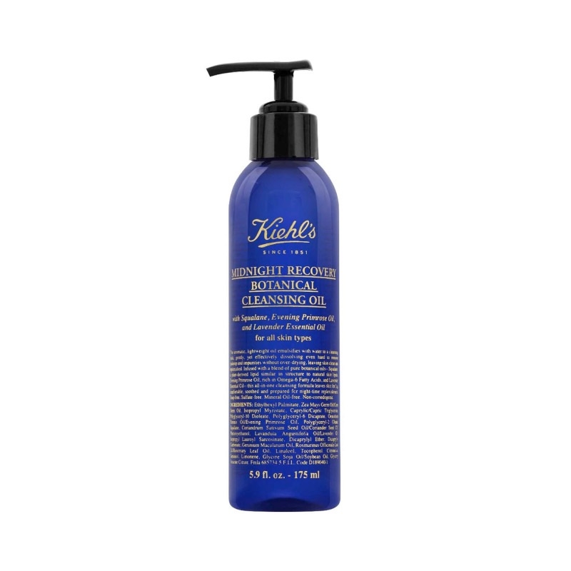
I’ve just came back from my Sunday walk. I’ve been to the shop which you might have heard of. They’re a skincare company called Kiehl’s. I was analysing things from their packaging to the way the place looked like — their designed experience was on point.
It was something like this: the employees were lab coats even though, a skeleton was placed in the window (the one you may see in a biology class) and as soon as you walked in they had a patient’s chair (the one with leather). Everything looked as if you got into a mad scientist’s laboratory and this is what they’ve been developing there.
A sink was placed in the middle and there were no mirrors.

This looks like something you won’t want to touch unless it’s heavy duty stuff. In other words, high-efficiency substance. On the other side, products may also have this old-school retro logo — they pride themselves with the fact that they were founded in 1851.

Give me three to four years and I’ll probably start my youtube show which will have me going into stores or company’s offices and review the experiences that they’re setting up. My point with Kiehl’s was that there was a strong narrative through which you’re taken as soon as you step in and that can stay with you after leaving the place.
That’s what every company should be about, given the way society is heading.
Yes but…
You can look at this in a very cynical way and say “yeah whatever, why does it matter? It was just a label, you can put lab coats on your employees if you want to”. At the end of the day
- Kiehl’s laughing in a language called profits
- They definitely went on and tailored a path that said what they were about
Regarding cynicism, it’s like nihilism — anyone can pick an interval out of context and say it doesn’t matter. I can definitely see Kiehl told people what they were about and I think you should too. And by the way, if excuse number 1 was the cynical thing, excuse number two is “yeah but they’re a lifestyle brand” — if you’ve been following my blog posts you will see me talking about the utilitarian value.
I think just because this is a skincare company, it doesn’t mean we can’t learn anything from it as a tech company. Eventually, all companies will have to differentiate by personality.
Adding this layer on top of what you do can be the way to go. Have a look at Kiehl’s shop if there is one around you and it will definitely make more sense than a written post. It’s hard to transcribe a package of feelings into words, which is why word of mouth happens — if I’d be able to fully describe to you
About Ch Daniel
I run chagency, an experiences design agency that specialises on helping tech CEOs reduce user churn. We believe experiences are not only the reason why users choose not to leave but also what generates word of mouth. We’re building a credo around this belief.
If I’ve brought you any kind of value, follow me and get in touch here: LinkedIn | Twitter | Email
I’ve also created an infinitely-valuable app for sneaker/fashion enthusiasts called Legit Check that impacted hundreds of thousands over millions of times – check it out at chdaniel.com/app
Please share this with someone and subscribe to our newsletter!— helps us keep pumping content?


