Reducing user churn is a complex topic. Lately I’ve been focusing a lot on the concept-dreamy dimension of it but here’s a very practical thing.
Dark mode. Ever since Mac OS X’s update, the idea became pretty much vetted — it is going to stay here for good. I myself loved it ever since I found out about it.
What I have on my mind is this: don’t burn my eyes. Don’t make your app/website impractical by not having everything set in place for dark mode. If everything is dim and smooth — I’ll trust you and I’ll turn my brightness up. However, once I get to a loading screen that’s all white (or anything that hasn’t been optimized), that’s when I won’t trust you as much anymore.
The longer explanation
A B2B SaaS might not benefit from it. Usually for something like these, there are a lot of elements into play. There’s only so much contrast that can be made through a dark mode interface — you might very well risk alienating or confusing the end user.
A stocks app could work well with
I’ve bumped into this problem as I’m redesigning my side-project. As much as I’d love the cool-looking dark UI, I have yet to find a solution to not burn the reader’s eyes when eventually they hit a long-text screen (which has to be black text on white background).
On another note, the shadow-realm-mode can massively contribute to the experience of the user. Once again, we’re talking subconscious and a topic that can’t really be described into words, it has to be felt.
For instance: if Snapchat would have become what they were looking like in their first years (i.e. a security/privacy company that’s focused on getting the message to the other side in the safest way possible), surely a dark UI would have benefited them.
I’d have felt like whatever I’m sending is secure and “whispered’. It can look mysterious but the place is subconsciously telling me that once a message is sent, the secret will be kept.
Sure, they eventually went on the lifestyle brand direction which is where they are today. But the 2013-2014 youth-friendly look could have been simply the pre-investment look that could’ve been revamped.
Practical example from the industry
The almighty Netflix. In some households, there are screens with a width of 50″. Maybe less, maybe more. However, that’s a big piece of screen. Emanating a lot of light when you’re trying to distinguish between movie titles might just create the alienation effect I’ve mentioned above.
Here’s the takeaway. This blog is all about the experiences. When I see dark mode, I think of something that can be mysterious. Maybe magical (hence some video games — think the ol’ Diablo). But more often than not, dark mode is there to make an emphasis on the content.
Surely Facebook and Instagram will eventually come up with that. I think the iTunes/App Store is a perfect example for that. When there’s less effort on your side to adjust to new information — your pupils have to dilate and a plethora of other chain reactions happening — your brain will accommodate faster the “dynamic” elements.
In practical terms, there is more emphasis on the movie titles, app icons or whatever is being presented/sold there. Hence the Netflix and App Store examples.
P.S: Everything I’ve mentioned is applying not only to Dark Mode On/Off products but also to strictly-dark-UI ones
(Feel free to read the article written by my friends at Toptal as well!)
About Ch Daniel
I run Chagency_, an experiences design agency that specialises on helping tech CEOs reduce user churn. We believe experiences are not only the reason why users choose not to leave but also what generates word of mouth. We’re building a credo around this belief.
If I’ve brought you any kind of value, follow me and get in touch here: LinkedIn | Twitter | Email | Quora | YouTube (same content but in video)
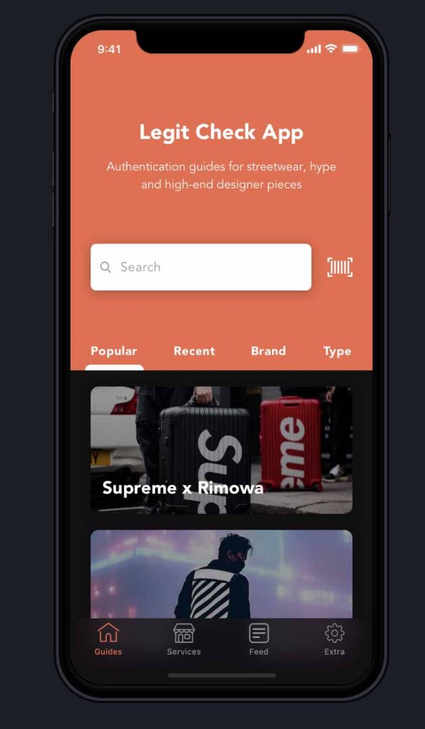
I’ve also created an infinitely-valuable app for sneaker/fashion enthusiasts called Legit Check that impacted hundreds of thousands over millions of times – check it out at chdaniel.com/app
Please share this with someone and subscribe to our newsletter!— helps us keep pumping content?