I look at SaaS companies websites on a daily basis. This gives me the insight so as to see patterns emerging within these products and the way they’re presented.
There’s one thing though that a lot of us seem to forget. The upcoming generation grew up with either smartphone or computer interaction on a daily basis. They run away as fast as possible from manuals, guidebooks or instructions when it comes to technology. Just like when they were 6 and they found out how to use the mouse cursor by themselves (i.e. picked it up along the way), they’d rather do the same with everything that’s technology.
Therefore, the reason why Terms and Conditions pages bounce rates are virtually 100% among these people seems to be apparent when having this in mind.
I truly believe that within the newer’s generation mental state there is a pattern of ADD being ingrained — not if we compare members of the same cohort, but if we compare it to previous generations members.
In simple words: the average person born in 2000 looks like he/she has ADD, if compared to someone born in 1960/70.
And that’s not a bad thing. It will go more and more into that direction as tech (VR and ML) advance. Their smart fridges will replenish themselves based on their eating habits but I digress.
The usual: Why should I care?
Let’s get to practical now. On a website, for instance. How many items do you show me at once? And the corollary question: how many items will grab my attention at the same time?
The third (and maybe the most important) perspective of this question:
How many items will risk your user’s attention?
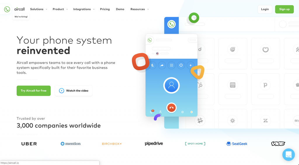
Take this website for example: Aircall.io.

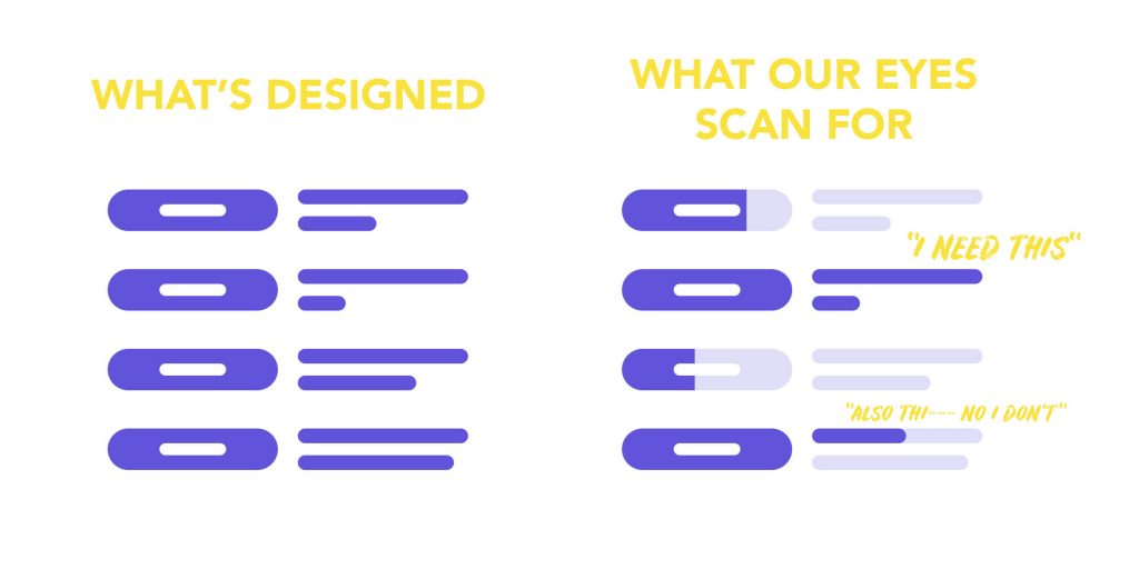
What the hell should I look at first? There are so many items here that my eyes go like this

Too many things are getting my attention. They’re colourful and there’s no guidance on what path my eyes should take — I feel lost. There was also the cookie banner which I dismissed. And this is not about elegant simplicity .
Let’s count how many visual items there are here:
- Big illustration – dashboard
- Smaller illustration – phone
- Navigation bar at the top
- Login/Sign Up
- Header
- Subheader
- Call to Action – 2 buttons
- Trusted by over …
- Logos of companies
- Intercom/chatbot in lower right corner
Let me show some understanding. Yes, a website aimed for elder people will have significantly fewer elements and complications than one aimed for tech people. There’s a line, though, for having too much.
Your user’s attention is limited — are you tailoring his time to your website or, in fact, whatever you’re showing him?
What goes through my mind
Looks cool, I can sense the target audience to be the CTO or at least some tech-oriented person. Aircall. Your phone system reinvented. Okay, so it caters to the right people with their design language.
Trusted by over 3,000 companies, I can see them here. Social proof, Uber uses it — it’s good, it’s legit. Where should I go now? Scroll? Try Aircall for free? Watch their video? Click some stuff on the right-side illustration? Is it even clickable?
Insight
People quickly scan with their eyes the most important items in a layout. That’s why we use headings, spaced out paragraphs, chapters and tables of content. But when everything is too cluttered, the quick-scan gets lost within itself.

And back to the generations observation — it applies no matter the age range. It’s just that the younger the cohort, the faster your “plot” should be.
Books have some text on the back cover or somewhere small on the front one — they tell you quickly what they are about or at least who is it for.
Movies have their plot written when presented — an easy-to-be-read note that tells you in a couple of seconds what it is about. A selection process, if you want.
Does your product have this? Can I find out in 2-5 seconds what it is about?
About Ch Daniel
I run chagency, an experiences design agency that specialises on helping tech CEOs reduce user churn. We believe experiences are not only the reason why users choose not to leave but also what generates word of mouth. We’re building a credo around this belief.
I’ve also created an infinitely-valuable app for sneaker/fashion enthusiasts called Legit Check that impacted hundreds of thousands over millions of times – check it out at chdaniel.com/app
Please share this with someone and subscribe to our newsletter!— helps us keep pumping content?


