What I’ll be writing about today is something happens to you all the time.
I was using an online service the other day and this happened while I was in auto-pilot mode. In other words, I wasn’t 100% into what I was doing as my attention had to be divided amongst more things.
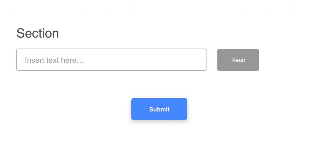
It looked like this.

Filled up the input box, pressed the grey button. I can’t even remember exactly where this was happening (otherwise I’d have put their interface) but I know for sure the grey button didn’t say reset. However, that’s what the button did.
What I was needing was the blue button. That was the “next step” function — it makes sense if I put it like this, right? Coloured means click here, grey means utility button.
Is that a mistake from the website’s side? Definitely not. But you know how some people say you must assume your user is the dumbest case scenario? I’d say that’s a bit brash — and if you’ve read my past content you know I’m not shying away from being calling things as they are. However, here’s how I’m looking at these “words of wisdom”.
They might be said because they’re memorable. You might laugh when you hear it the first time and it sticks. But much like some other sayings we’ve got as humans, they just scratch the surface: they give you some pointers of what you should do but not convey the reasoning behind it.
I wrote in this specific piece about mindset and advice — have a read. It’s the same principle here.
“Ok, so what are you saying?”
I’d say usually it’s like my case, where the
Similar to most of my posts, we’re simply over-analysing a small and quick event. One could call it trivial. Naturally, after what I described at the beginning of the article, I just retyped it and went my way. It’s no rocket science.

But why am I here writing about it? Because reducing user churn is pretty much about alleviating every single step that a user might take. I was sold on using the product, it didn’t matter. Here’s when it can matter:
It can be the name of the company that doesn’t convey the message you’d want.
The new sales agent that’s not a good fit for this specific group of customers.
Maybe it’s about having too many things going on on your homepage.
That’s a clear example of what “user is dumb” won’t catch but “user is not fully paying attention” will.
Or, when something like this happens during the onboarding process.
This person is taken one step back, she may cancel the whole sign-up process because of it. Let’s say she received a phone call and thought “I’ll come back later to it” — totally forgets and never does it again.
To double-down, maybe she might have been the best client ever, bringing you not only financial riches but also very good words to people around her.
All lost because of an “unalleviated” step. Or, indeed, maybe she wasn’t this customer — but we’re more likely to think (and discuss) about what we might lose and. Hence the user churn focus of mine.
My point with this written piece is to change the mindset from “make it work even for the dumbest” to “make it work even when they don’t pay attention — because the majority won’t”.
When you make the shift from the first mindset to the second one, you might engulf more pain points. More pitfalls in which your clients might fall along the way (and thus you’d never hear back again from them).
The bottom line
And then, maybe only then, you can account for “dumb” — only after you’ve managed to suck them into the experience you’ve tailored for them — very related to what I wrote about yesterday, a good example of immersing users.
But until then, I’d assume you didn’t get people’s full attention — because fewer and fewer things get our full attention these days.
About Ch Daniel
I run Chagency_, an experiences design agency that specialises on helping tech CEOs reduce user churn. We believe experiences are not only the reason why users choose not to leave but also what generates word of mouth. We’re building a credo around this belief.
If I’ve brought you any kind of value, follow me and get in touch here: LinkedIn | Twitter | Email | Quora | YouTube (same content but in video)
I’ve also created an infinitely-valuable app for sneaker/fashion enthusiasts called Legit Check that impacted hundreds of thousands over millions of times – check it out at chdaniel.com/app
Please share this with someone and subscribe to our newsletter!— helps us keep pumping content?
Illustration Credits: Toast Studio, Oddis


