Before I answer the question in the title, a quick story.
A common mistake designers do at the beginning of their career is that they’re looking to do the cool, amazingly looking thing – be it website, logo or whatever. Definitely with some ostentatious animations and, if possible, some more of that. It has to be “the shit”.
Somehow, they think they’re competing with other designers to generate the most compelling output. Eventually, if they get out of that, they mature and start understanding about business goals. Consequently, they get tired of their previous pursuits and understand the elegance of simplicity. Simplicity is now not “bland”, “boring” or “missing something” as it was called before. No, it’s continuous refinement. You create a lot and then you remove a lot so as to keep only the needed elements.
That’s an aspect of simple elegance – one of chagency’s core values. The reason why I started with this introduction is that, even though you as a CEO will want to work with people who’ve been past that incipient stage, there’s a common possibly fatal mistake (or maybe event) that’s happening at a lot of ranks:
When does the work you’re paying for expire?
You hire this team to create a new website. It takes them 4 months to deliver something that’s going to be a fad in a year. So now you’ve got 8 months left until you need to go through this process again.
“A fad” – what’s that? For instance, these days a fad is isometric design, which I’ll illustrate below.

A random search on ICO Alert (a website listing new cryptocurrencies, an industry in which this mistake is commonly found) made me find this:
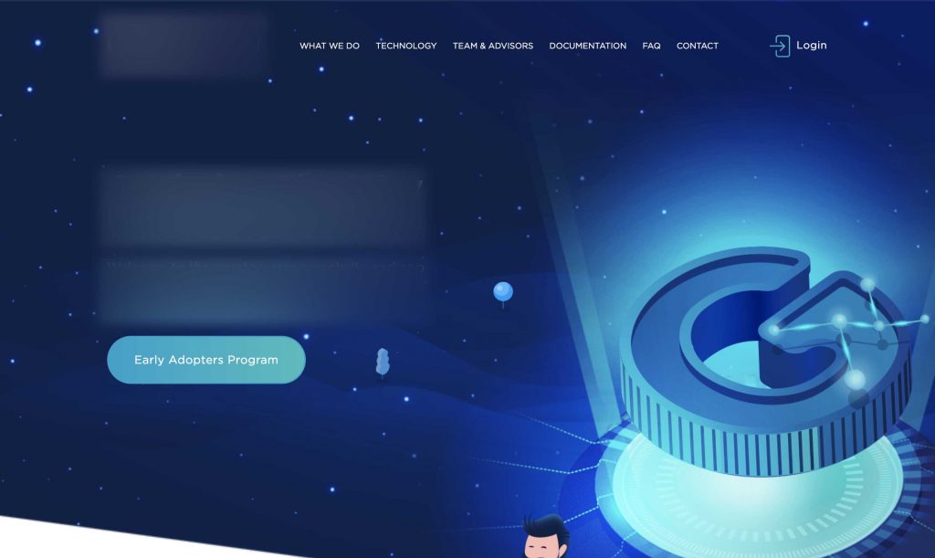
Surely in a couple of years it will either mature into something else or people will get tired of it and wince when they’ll see it. It looks cool and I like it myself , no deny about that — even played with this for a bit. But what about when we’ll get over it? Are you doing it just for the art, to “keep up with the trends in your industry”? Or is there a deeper plan in your strategy to deliver value in the best way to your end consumer?
I’d say keep the art for concepts if you’re one of those thinking a “fresh” look will be the Hail Mary move, Mr or Mrs CEO.
For concepts, have as much fun and art as you want. But until then let’s build an experience for your users that’s going to keep them on board and have them want to tell their friends about your product. One that stands the test of time through strategy.
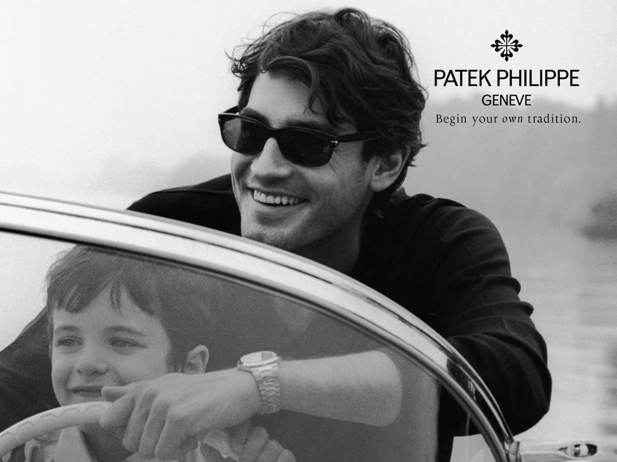
PFunny enough, right next to me as I type this is a full-page advert from Patek Philippe on the back cover of a magazine. Have a look at it:
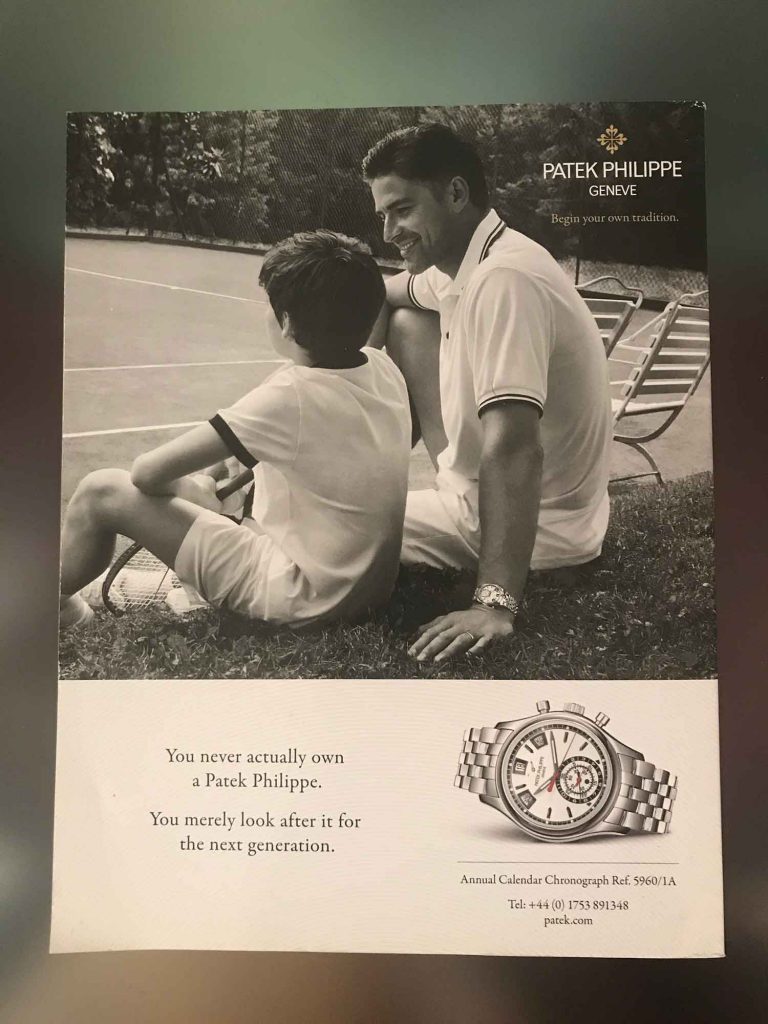
If you felt what I’ve noted above, you’ll understand the correlation between that and the Patek Philippe cover. If not, ask yourself whether you’re able to tell which year was this cover from. 1995? 2005? 2018? 2025?
More on this tomorrow.
About Ch Daniel
I run chagency, an experiences design agency that specialises on helping tech CEOs reduce user churn. We believe experiences are not only the reason why users choose not to leave but also what generates word of mouth. We’re building a credo around this belief.
I’ve also created an infinitely-valuable app for sneaker/fashion enthusiasts called Legit Check that impacted hundreds of thousands over millions of times – check it out at chdaniel.com/app
Please share this with someone and subscribe to our newsletter!— helps us keep pumping content?

