WeChat, in case you don’t know, is East Asia’s closest thing to the western’s WhatsApp. The only thing is, they innovated more and faster to the point where besides the usual texting, media sharing, voice notes or anything else that WhatsApp does as well, on WeChat you can:
- send money to friends
- pay in store
- rent a bike
- get a taxi
- pay bills
- go shopping
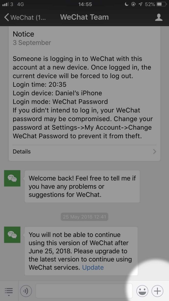
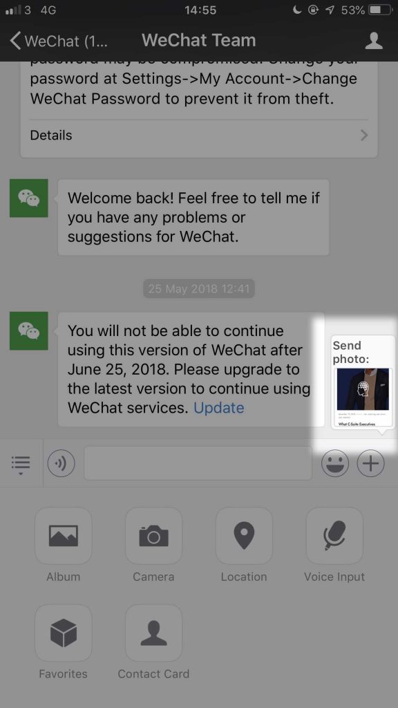
And a plethora of other things. That was the quick intro. Today’s micro analysis is a very small aspect that shows WeChat cares about its users. If you take a screenshot and go click the + button in the lower right

The screenshot quickly (ghostly) appears as a suggestion.

It’s a small thing – but it matters. It’s a tiny element that’s part of the experience. Dare I say, a link of the chain, because it got me knitted tightly(-er?) to their app. Now, not everyone should be analysing every single detail like I do right now as it’s something that you might not even notice, given how smooth it is.
Good design often goes unnoticed. It’s only when we encounter bad design that makes us complain to our friends and whatnot – especially when there’s a handle on a door that has to be pushed (the bane of my existence, honestly).
But back to WeChat, what does this tell us? It tells us that either their audience is sending a lot of screenshots OR that they cared about a tiny aspect like this. That they’ve used the app themselves to the point where they got an answer to the question “How do we make this more efficient, send them more time and create less friction for them?”
WhatsApp is not lazy overall, I’m sure they’ve got their priorities like monetising it. But they’re lagging behind a product like WeChat and the latter kicks their ass. Do I know the full story? No, I’m aware of that but I hope that as you’re reading this, a question emerges:
What’s the extra-step I can add for my user/s to help them even more?
Something I say every time: you made a playground for them. They’re putting their attention in your hands. Do you just let them wander around or take them by the hand and show them where they’re supposed to go? Another concept I keep writing about: consentful control. They let you control their journey, maybe subconsciously.
As soon as the consent is withdrawn, what happens then? Another aspect of an experience.
The bottom line is this: having in mind their experience is key to reducing user churn, increasing retention levels, facilitating word of mouth. And the next milestone of improving their experience is the holy grail. Your users giving your company the most beloved gift of all time: love.
About Ch Daniel
I run chagency, an experiences design agency that specialises on helping tech CEOs reduce user churn. We believe experiences are not only the reason why users choose not to leave but also what generates word of mouth. We’re building a credo around this belief.
I’ve also created an infinitely-valuable app for sneaker/fashion enthusiasts called Legit Check that impacted hundreds of thousands over millions of times – check it out at chdaniel.com/app
Please share this with someone and subscribe to our newsletter!— helps us keep pumping content?


