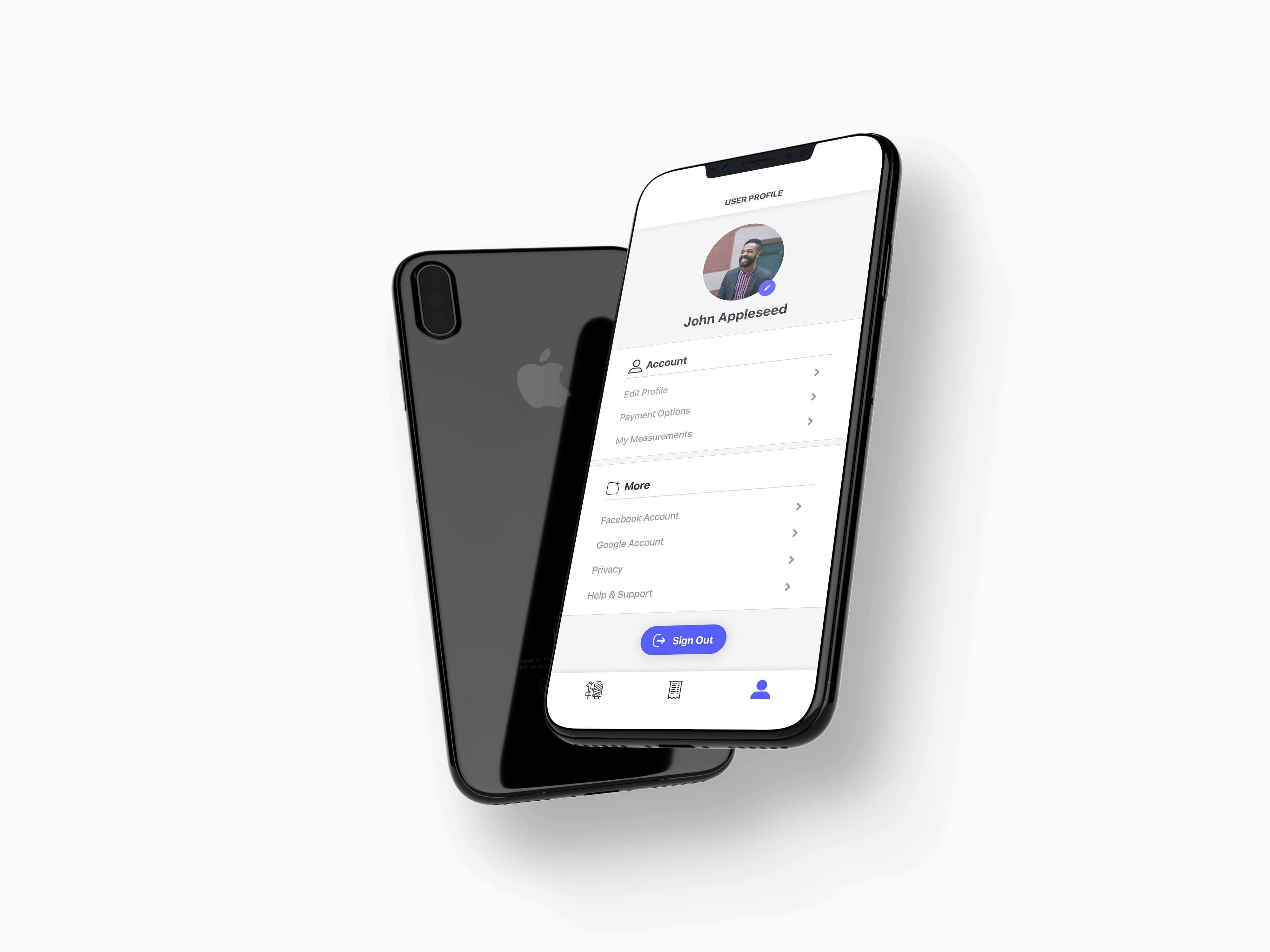
As our civilisation gets more connected, so do our professional services. What about tailoring? Alter is on a mission to become the newest generation’s reconnection to garment alterations.
How should the online tailoring experience be designed so that a seemingly complex process becomes both easy and a matter of seconds?
Alter collaborated with Chagency_ in order to set the standard of a new industry. A seamless process for a customer-centric experience — making altering effortless, efficient and far from complicated.

“What’s good for the users is even better for the business” has been our foundational belief that shaped every fruitful engagement.
We’ve subjected Alter to our successful process that eventually constructed the design strategy. Who would be, then, the power users of Alter that are going to spread the word around and thus become brand ambassadors?
Facilitated sessions resulted into these two main user profiles that went on to be the basis of the created experience. We then tuned in even further to delineate the identity of Alter: how will its voice sound like? What is its culture like? What tangible value do the users get when interacting with it? How does it make them feel?
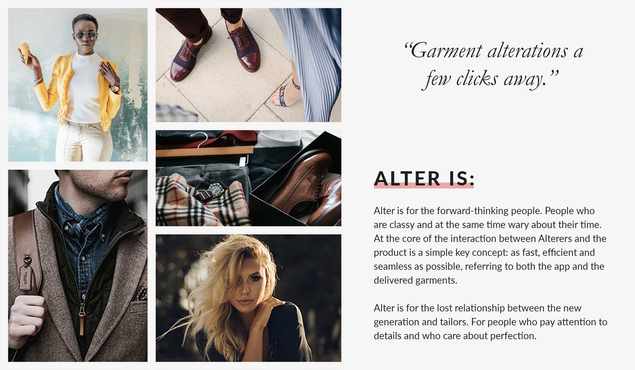
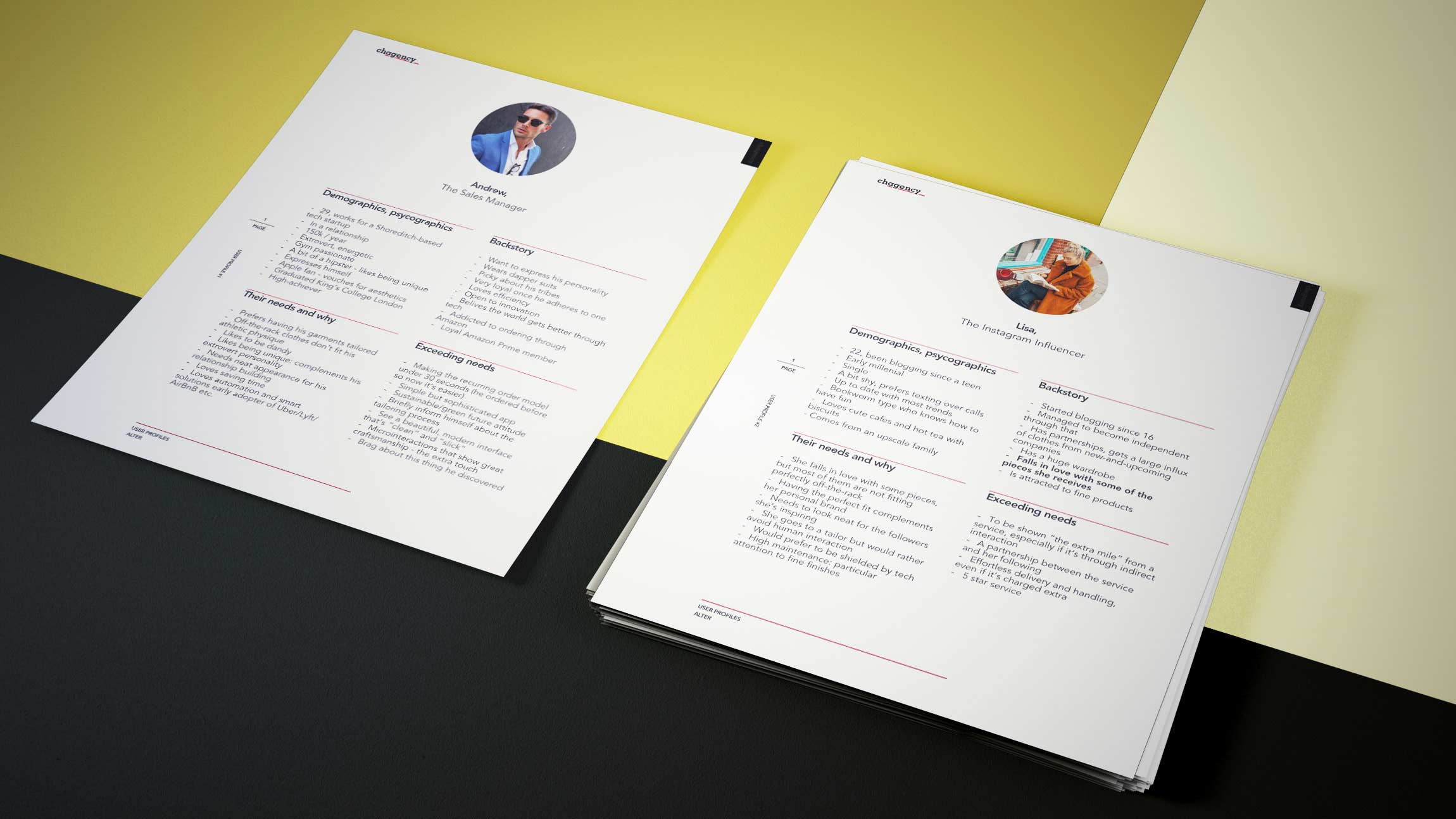
Eventually, key insights surfaced about the behaviour, demographics, psychographics and the pain points of these users. The conclusion: our laser-precise targeted audience is about people who:
- care about the perfect fit for their garments
- are keen to discover and experiment novelty, as opposed to being appalled by technology
- believe the world is becoming a better place through technology and through a positive-sum (i.e. win-win) game environment
- are looking for optimisation in their life and love to share the perfectly-working solutions with people around them
Alter needed a mark that would represent and define more than just tailoring at your fingertips. As we listened to the founders and their vision, one theme seemed to emerge that was prevalent for the company among long periods of time: measurements.
As the B2C dimension was quite clear, there was another aspect of Alter that made it great — in the long-run, users measurements turn into very valuable data. At the same time, it's the basis of why the company functions: to get people's measurements once and eliminate the stress forever. No more returns due to bad fits, no more repetitive measuring sessions.
The theme was not obvious, yet it's what Chagency_ uncovered to be the essence of the company. Needlessly to say, the visual identity that resulted matched the founders' vision before they even knew it — conveying perfectly what they're about both to their users, the companies they're doing business with and to themselves.

Tailoring might seem like a service that's too complicated to be digitalised - it’s usually based on multiple one-on-one conversations and it rests upon a relationship built between the professional tailor and the customer.
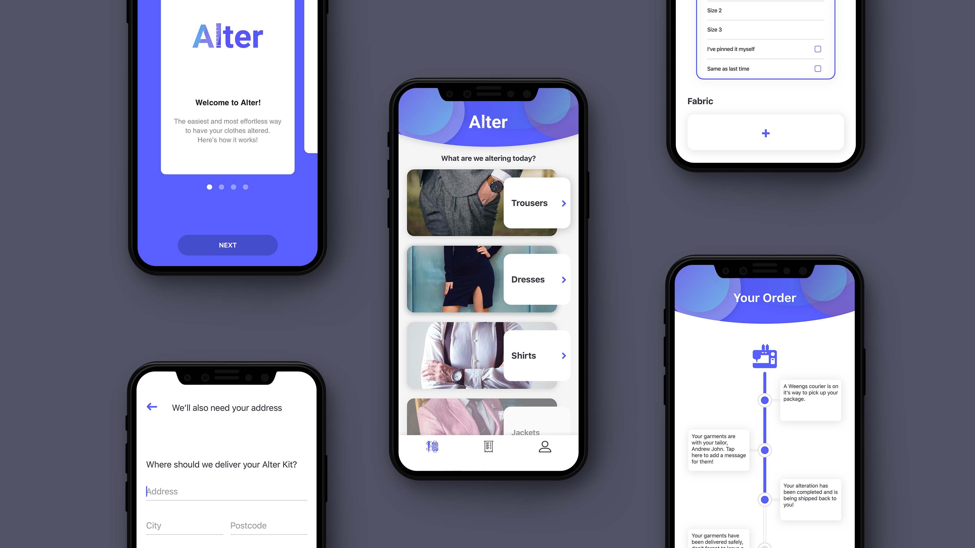
User retention levels were the primary goal of this project. An identity system was designed and deployed in order to make the process straightforward, resulting into an experience that’s at least 10 times more efficient than the actual process. A clean and minimal interface is the foundation of the visual identity - every button, image or text box is carefully curated and placed.
In order to choose the visual realm of the experience that was going to be designed, multiple stylescapes were put together.

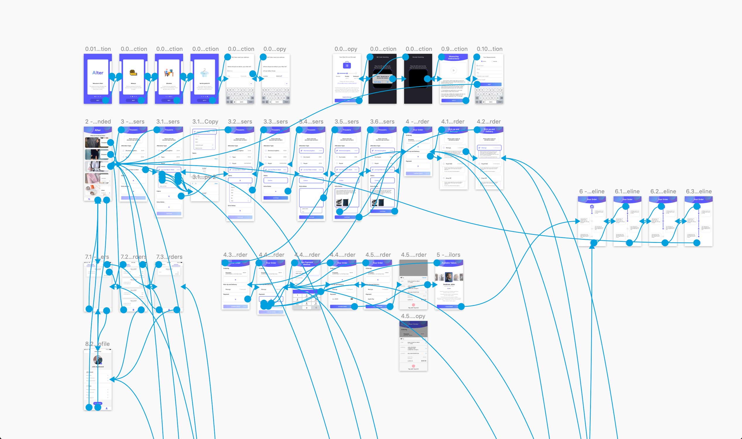
Chagency_ developed a smooth flow of interaction which had one deeply-permeating philosophy: the Japanese "shibumi".
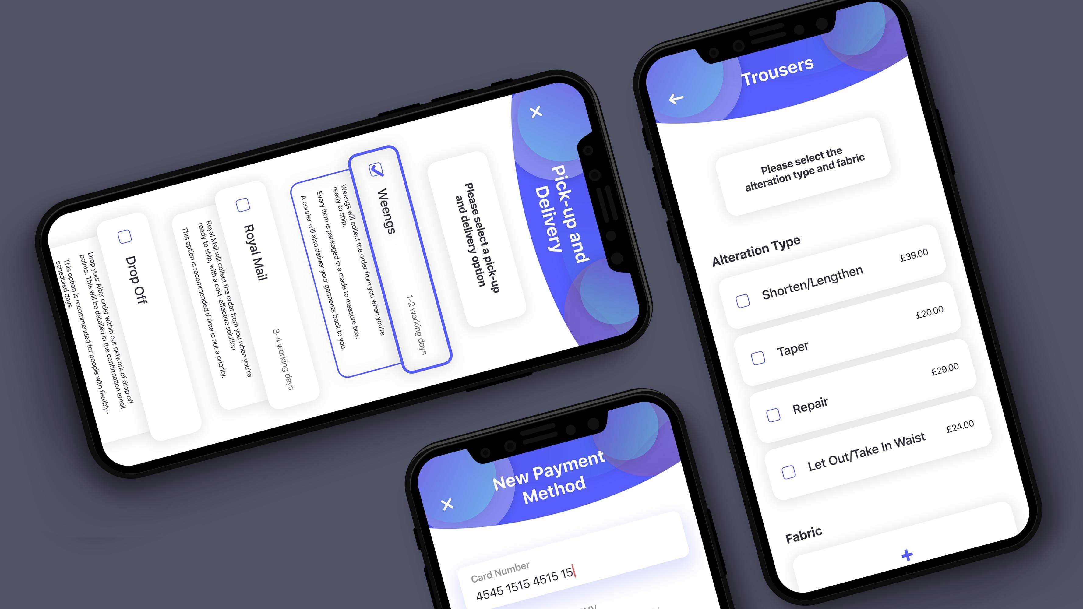
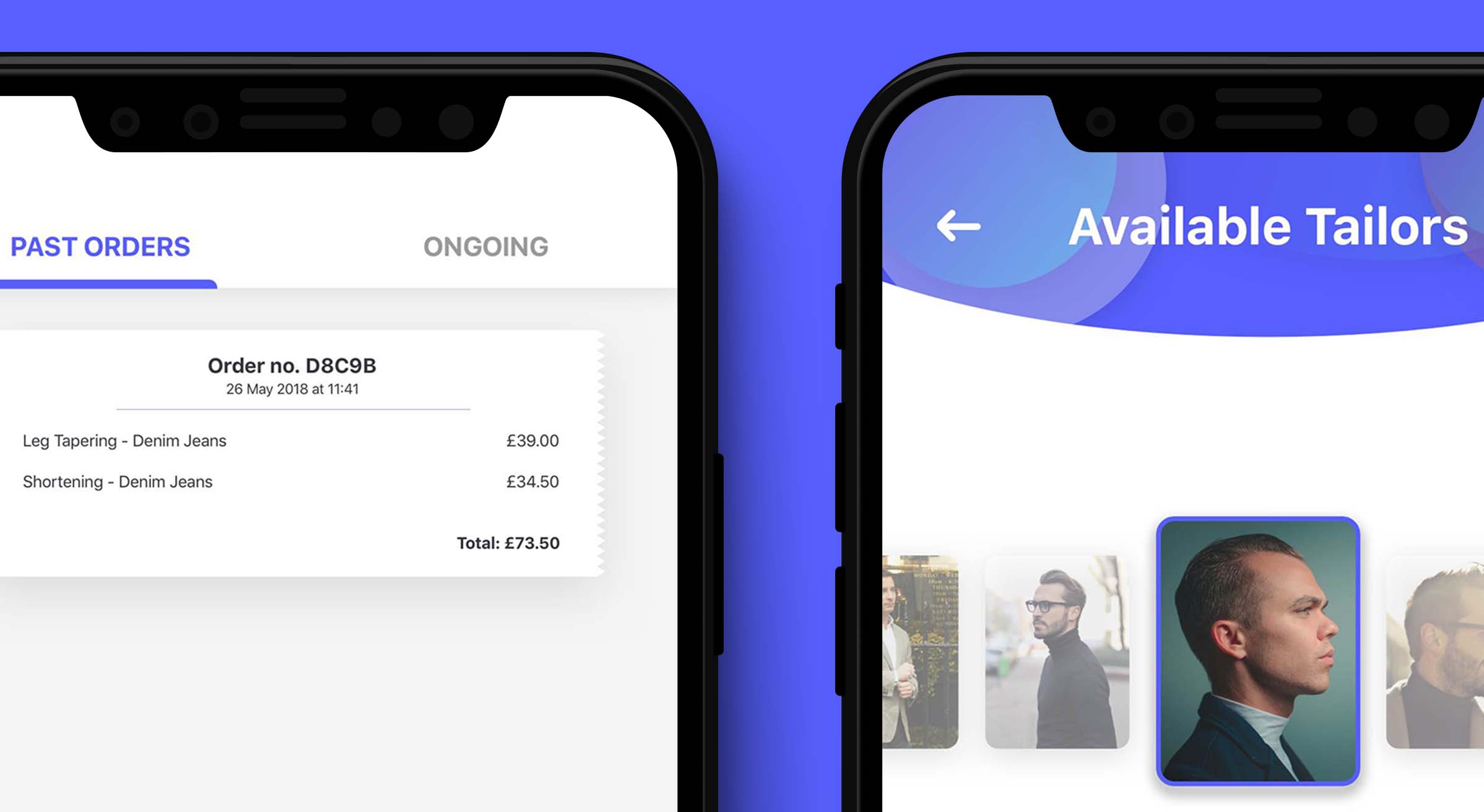
In practical terms, this meant: as few screens as possible, as little input from the user as possible and a very efficient way of navigating through the order process. The "build your own bill" process was developed so that between the beginning of an order and the "order progress" timeline (tracking number, shipping, delivery), there would be only two major screens:
I. Alteration details (material, type of alteration etc.)
II. Order details (shipping, payment etc.)
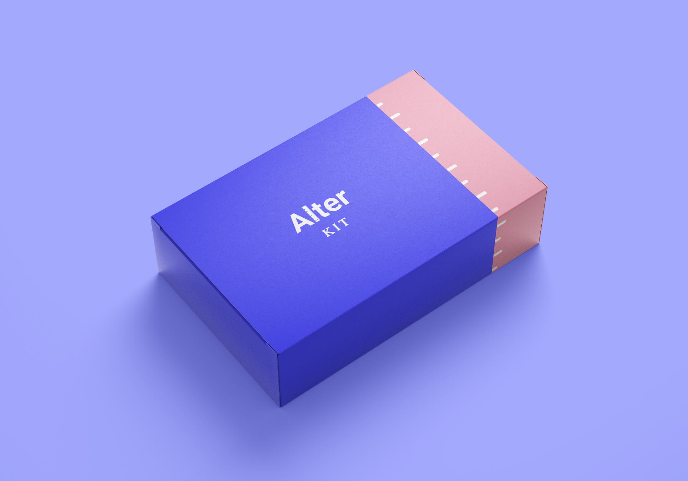
Behind the scenes, the company’s bigger vision is one of a greener planet. By bringing measurement kits into every user’s house and collecting information about how the garments suit them and their preferred fit, Alter is on a mission to reduce the yearly amounts of money lost from returns in retail - studies’ numbers vary between £60bn and £500bn yearly.
