MENTAL CLUTTER
Reshaping the conversation around mental health
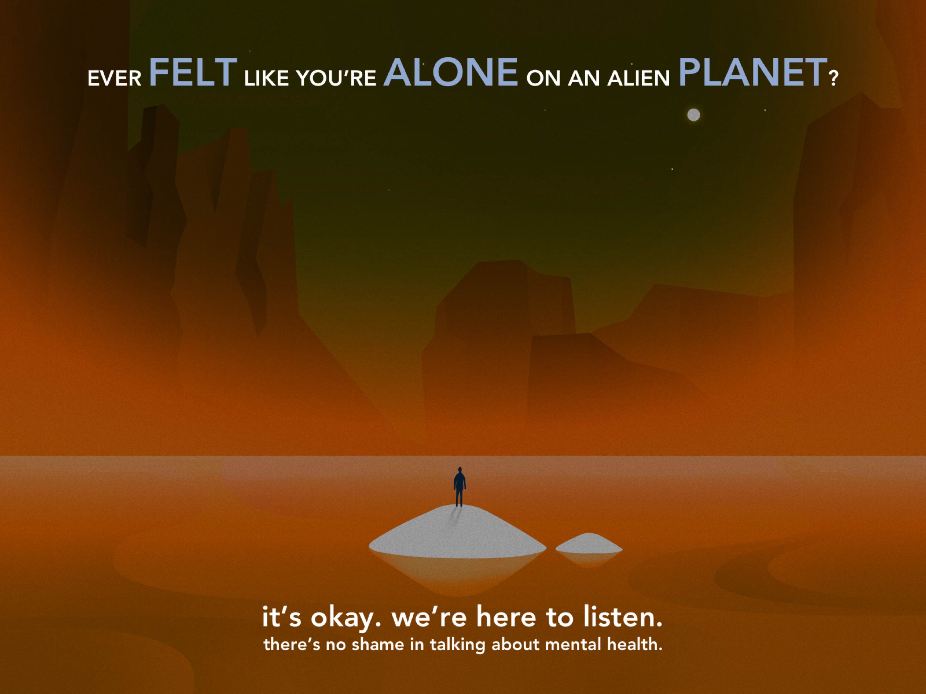
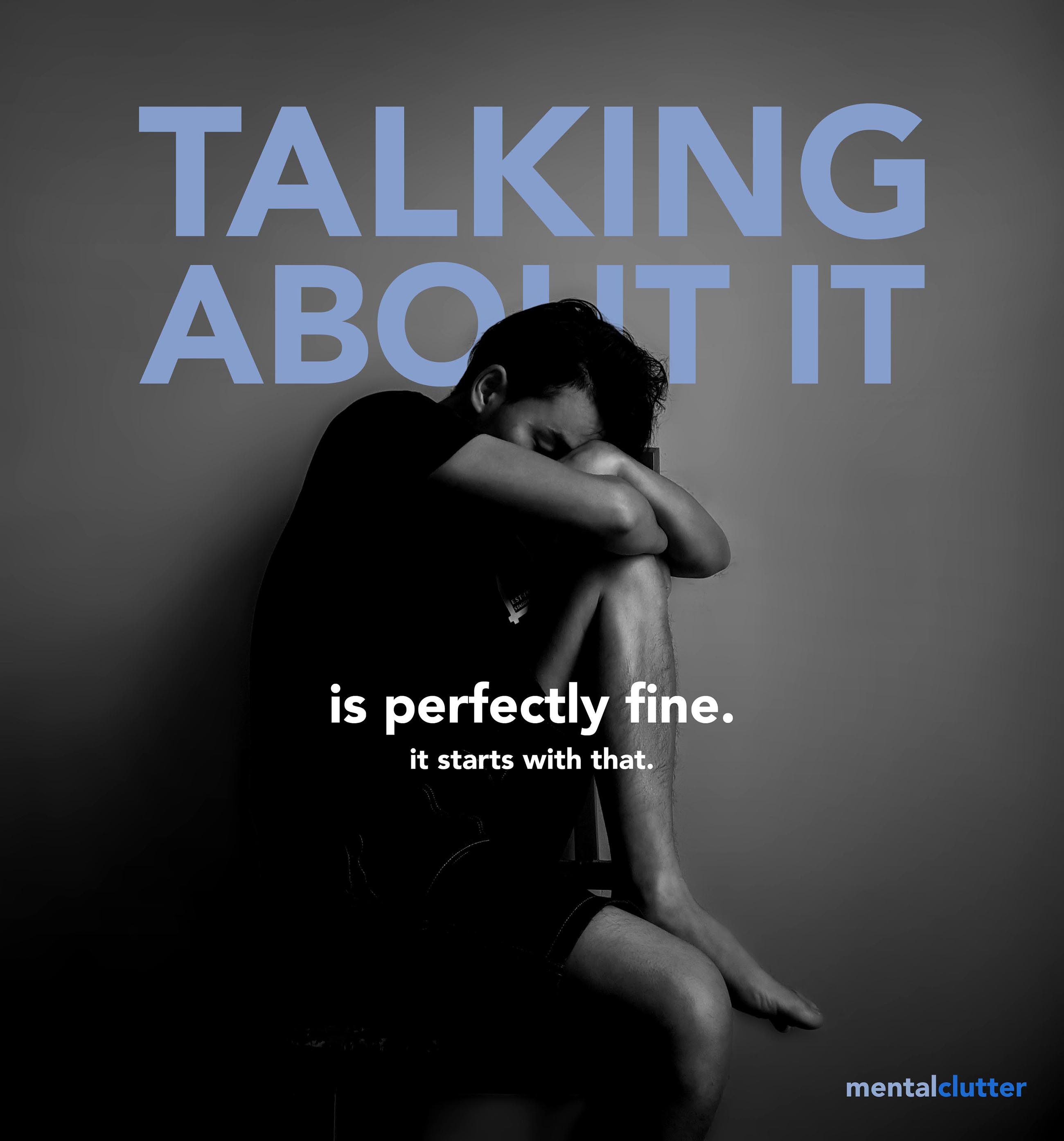
Mental health is something that sounds scary. The first thing society might think of is mental sickness - but it doesn't have to be like this.
How should we educate people on mental health, talking about depression and anxiety, without antagonising the stigma of being “mentally sick”?
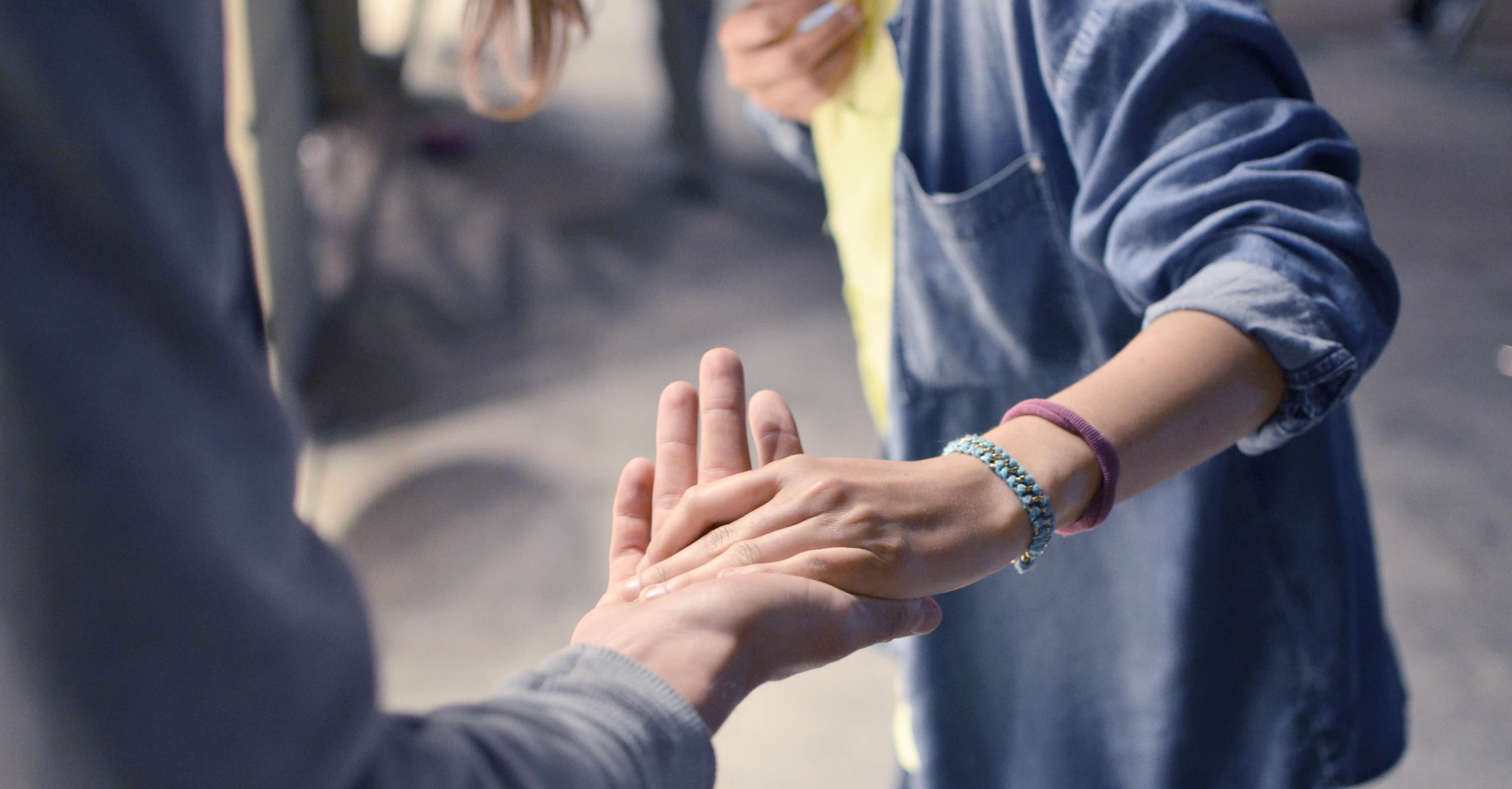
The Chagency_ team used customer-centric thinking in order to design Mental Clutter as an experience that seeks to connect deeply with the user, creating a place of comfort, empathy and stillness.
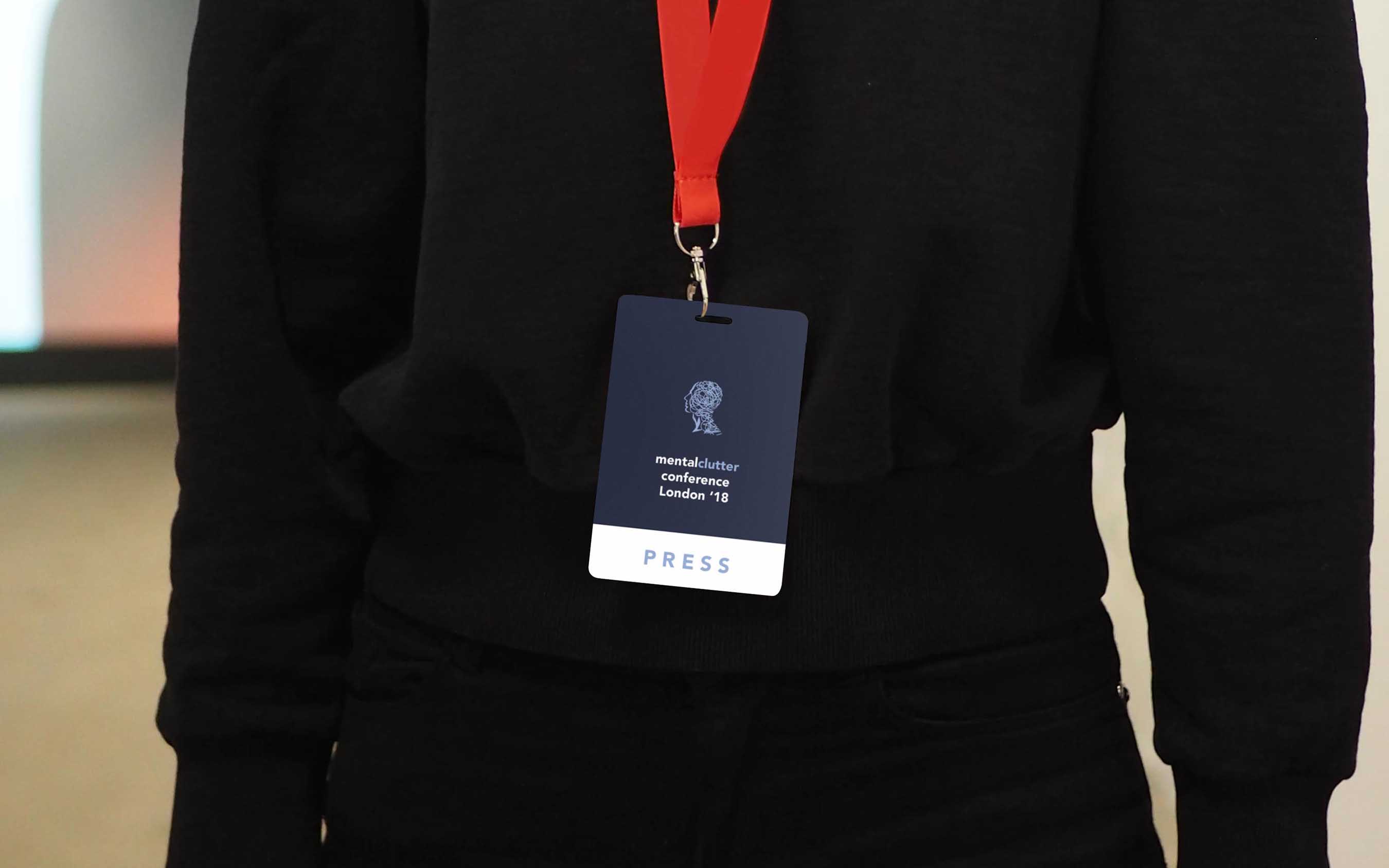
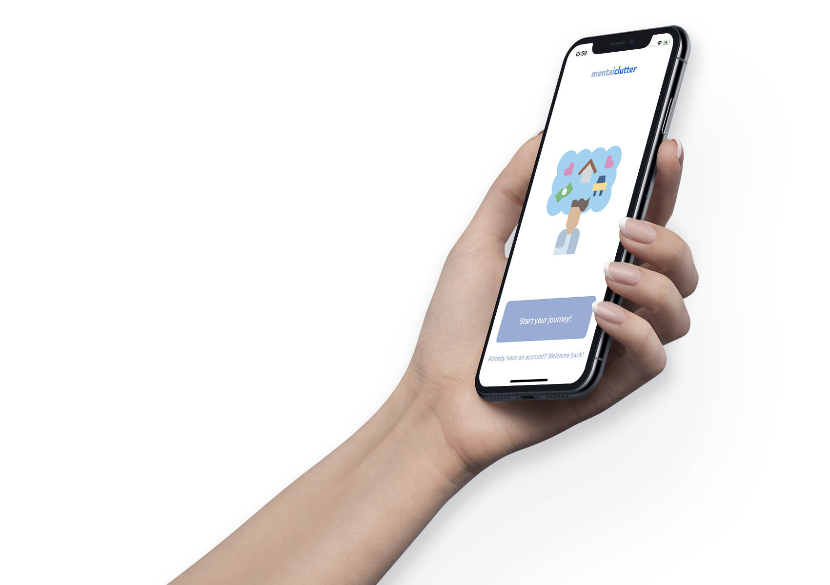
The team worked closely with Mental Clutter on developing a space with an identity of its own: rather than a simple collection of pieces of information, the approach consisted of establishing a relationship based on a friendly voice and friendly faces. The environment conveys a narrative of positive change.
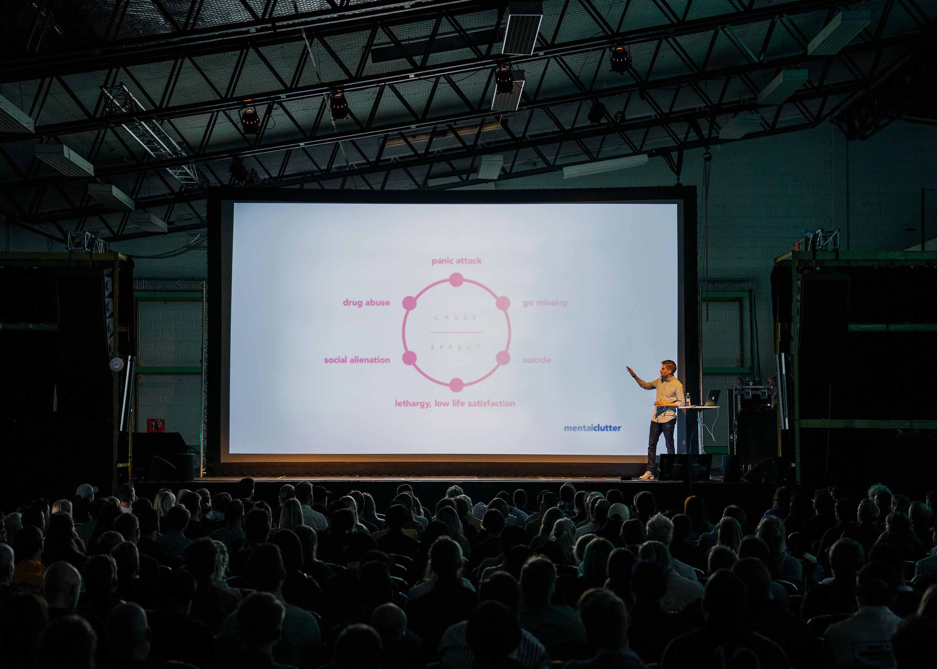
People have been educated on gym and body health - the majority knows that they have to drink at least 8 glasses of water a day, exercise twice a week. Mental health is the next milestone we’re looking at as a civilisation, as 1 in 4 people officially suffer from mental health issues.
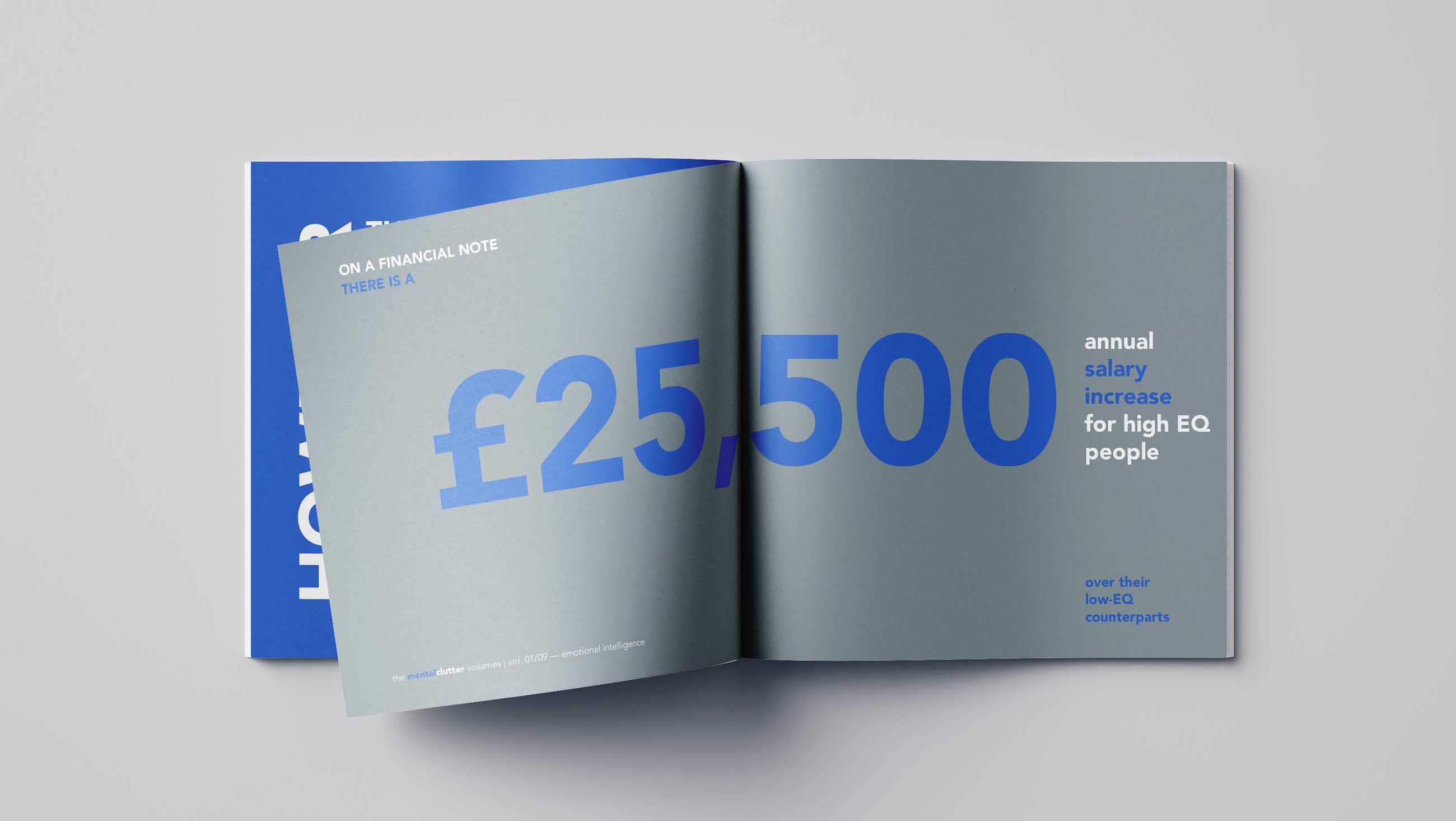
The NHS (UK's National Health Service) alone paid a bill of £11.6bn for mental health in 2016/17.
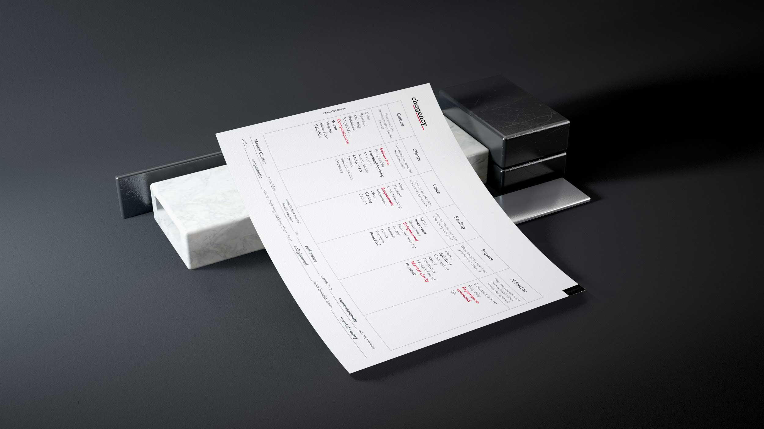
Mental Clutter's app needed to feel inclusive for a broad range of users: people of any gender, aged young to mature. There was no doubt about some coordinates of the demographics and psychographics, however through deep strategic research and facilitation, Chagency_ managed to come up with key insights.
These insights helped shape the visual direction of the app - developing an experience for the people that were going to use Mental Clutter. Chagency_ crafted a multitude of stylescapes that consisted of visual elements that resonated with the freshly-sculpted brand and were part of the designed experience.
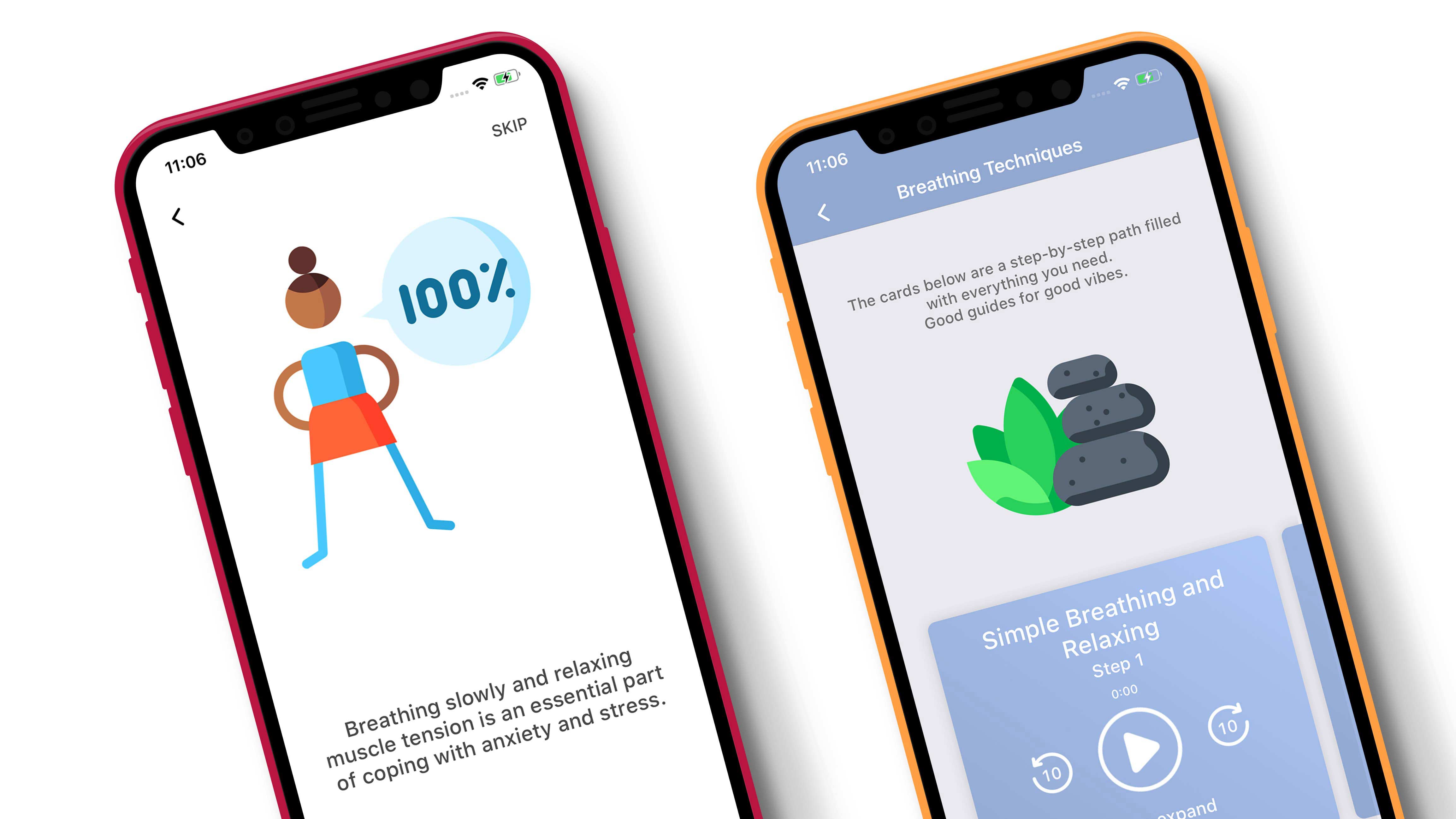
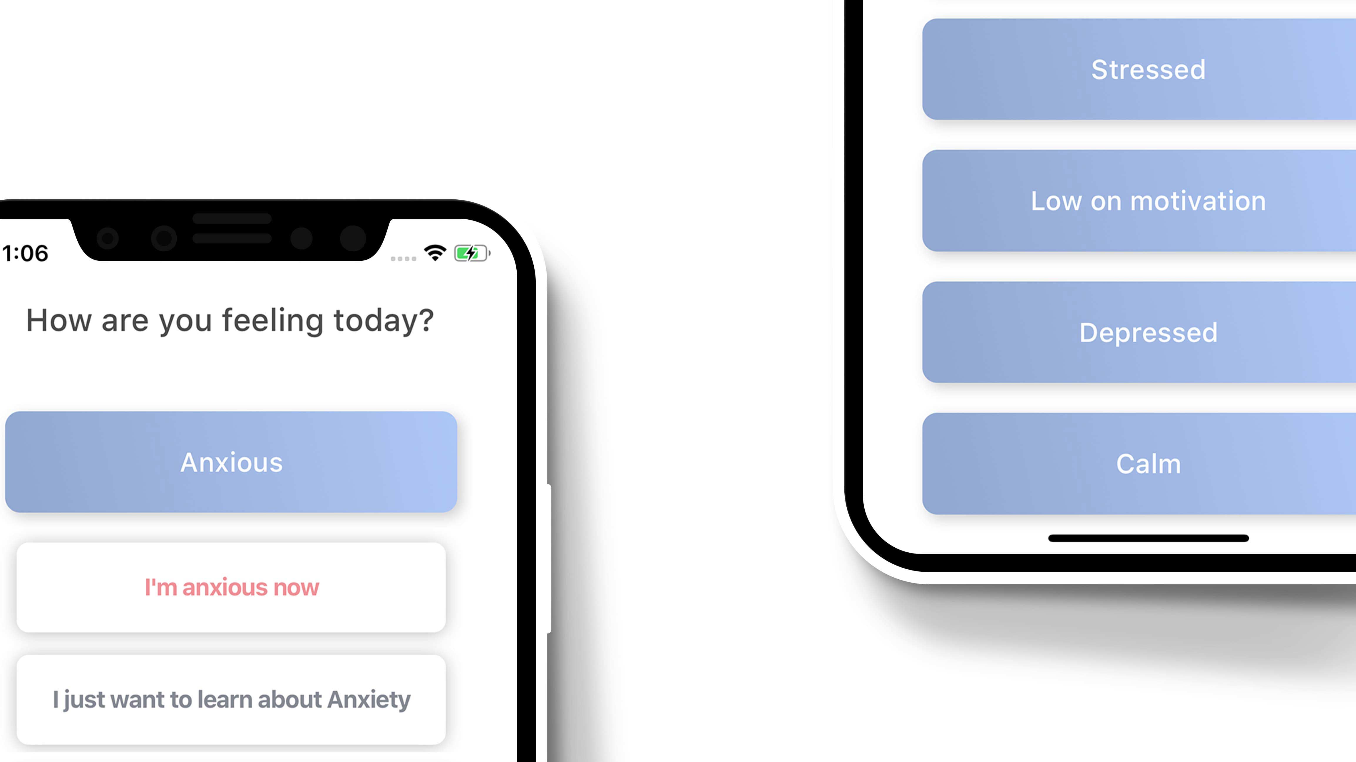
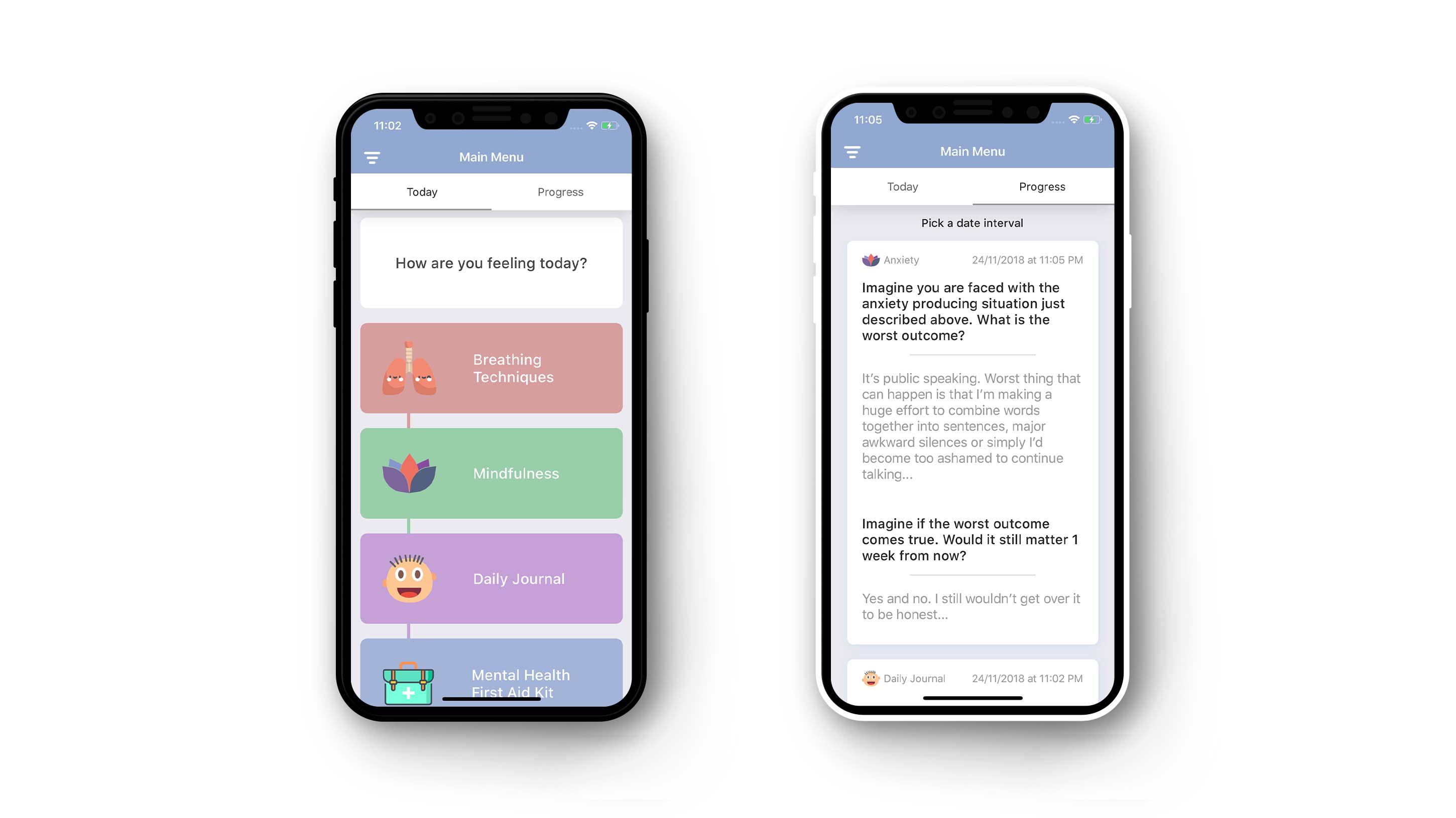
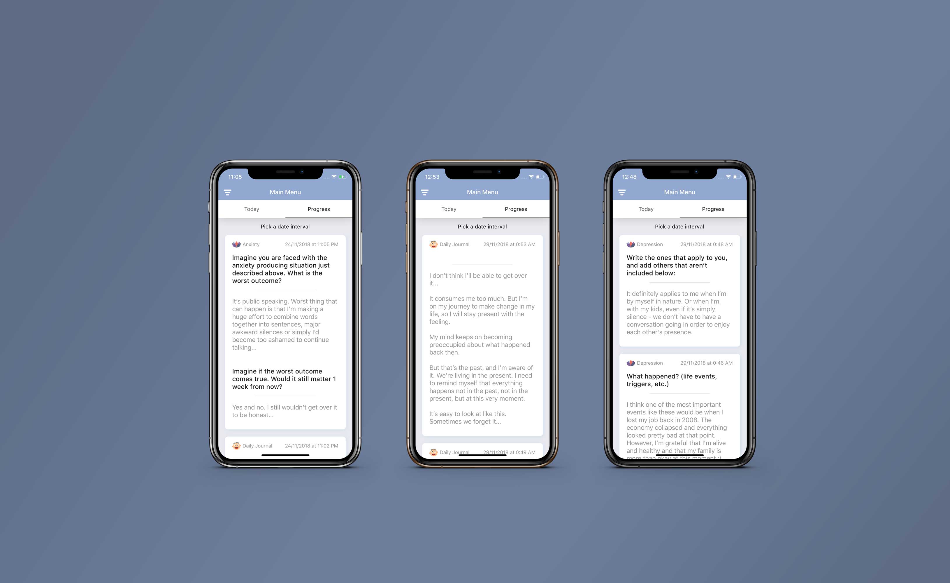
Mental Clutter's realm was about clean, sleek cards that are gatekeepers to an actual solution for the user. Its typography is clean and dispersed, so as to create a subconscious concept of space.
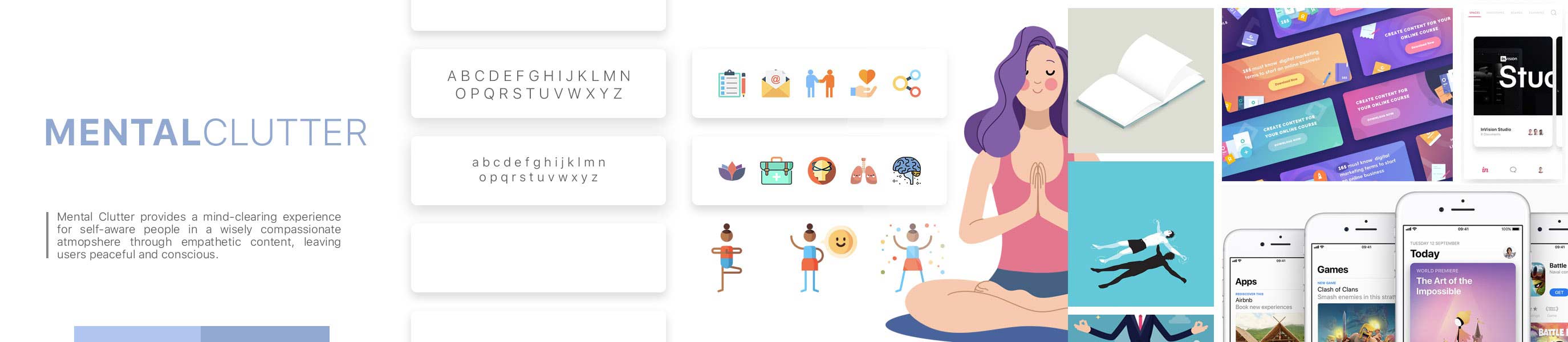
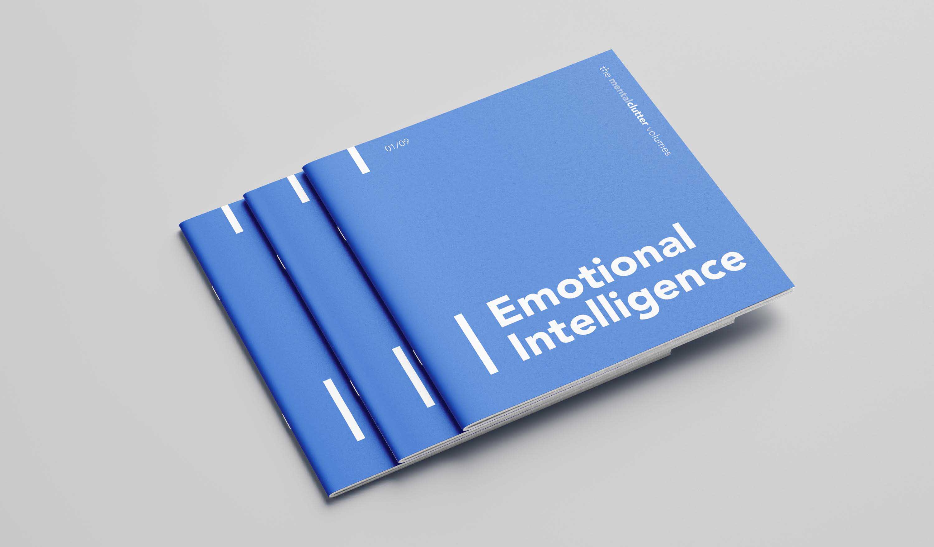
The visual identity features a welcoming typeface, paired with the amiable colour chosen by PANTONE® as one of the two colours of the year 2016: Serenity.
The company's voice threads gently around the user and knows when to interact and when to listen. The place of stillness described above is manifested in an area where the user is able to see their progress - sometimes guided by questions, sometimes by their own initiative, in the daily journal section.
We believed in Mental Clutter's core value and made sure this proposition is brought out to light in front of the users.
Mental Clutter's vision doesn't stop here - their plan is to bridge the gap between humans and their mental wellbeing. Through this, the company becomes the fulcrum for future improvement.