On a global scale, we’re drowning in information — and every day it gets “worse”.
I wouldn’t call it “worse” if I were you.
If you know you’ve got something of value, then it won’t be a problem. But without a doubt, there is more content, therefore there are more things fighting for everyone’s attention coins.
All these ideas of
“explain to me as if I’m a Labrador (if you want my money)”
or
“tell me ‘iPod, 1000 songs in your pocket’ and not ‘iPod, Two ARM 7TDMI-derived CPUs’
are put out by me for a reason.
I’m not spreading them (just) because they sound cool in theory.
I’m spreading them because I want less people to churn out of your product — or out of your website/app/idea/vision.
If you’re not explaining what your company can do for the person in the first few seconds, the game’s over — we agreed on that. But there’s more to it.
What’s the next step?
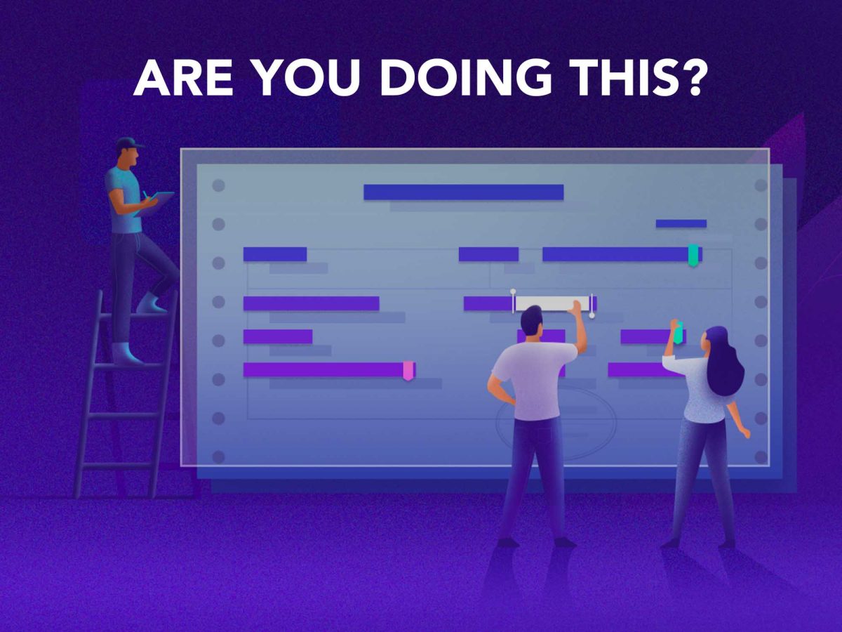
Don’t fall into THIS trap
The rest of the pitch you’re showing to your homepage viewers should be like the tweets. Or like the LinkedIn one-liners (mentioned in yesterday’s article).
You might look at big companies: Apple, Stripe, Uber etc. You might say “Yes but this is how they do it, they talk a lot! Why shouldn’t I do it as well?”
But we must be careful not to do what works for big companies all the time. They got to that level/size because they’ve been through a 5-year-old-explanation presentation, at one point.
Short. And concise. On your full home page, explain to the reader like you would to a 5 year old — that means both header and the following points.
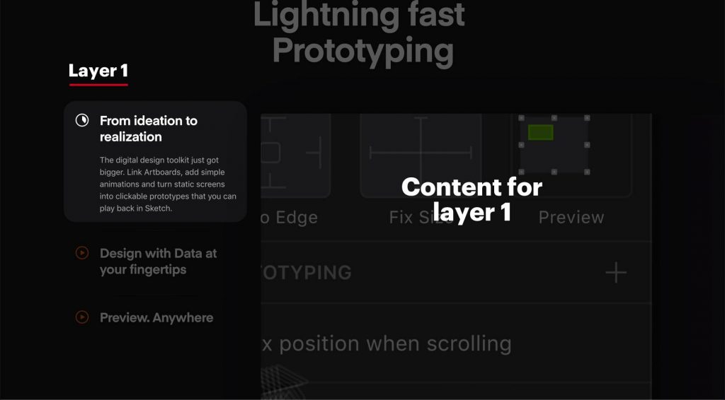
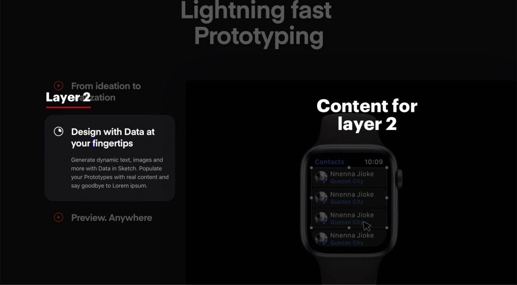
Having a look at the current typical structure in web design, you would notice this pattern:
Text Here
Picture Here
That’s a block. You see it as one chunk and it reveals to you a bit more of this quick concept presentation. Then you scroll and you’ve got:
Text Here
Picture Here
This structure is put in place because it’s easily digestible by the reader and it forces you, the creator, to use 50% the screen real estate with an image. What does that mean? Less text.
The structure worked because it enforced people into this idea of quicker explanations (and more visual). We hear about these new startups that succeed and notice they’ve got this structure — we don’t hear about those which failed and didn’t. We infer it’s the way to go. And thank god, it is! At least for the moment.
One improvement on top of this was to create “module tabs” — we’ve layered information, so only if you’re interested in more you will be shown more. Here’s an example from
It respects one of the concepts in design (and life, I’d say) that I wrote about before here. The highlight:
When it comes to design, it’s okay to have a mess as long as you need to go through something orderly in order to get there.
It would be messy to have all that text and those 3 videos taking over the whole homepage. Put them like this? They’re going to auto-play into each other or you, the reader, can click on them only if it’s relevant to you.
That’s an element of putting everything out there in order to make sure a
The bottom line
Objection
“Ok, Daniel, what’s the difference between this article and the “explain to me like you would to a Labrador?” You just changed Labrador to “a
5 year old ” and said nothing new.”
The idea is that explaining this way doesn’t stop at headlines. It’s a rule to follow when explaining most of the stuff within the first interaction.
Now, it can either be this way OR a second way: talking directly to the person in the company (I mean job position. The CFO, for instance) that is going to make the decision to buy your product. I’ll cover that in tomorrow’s article.
P.S: Dayana Mayfield’s, who’s a SaaS copywriter, got 15 tips for you. Have a look at what she has to say over here, should you want to read about this topic further.
About Ch Daniel
I run Chagency_, an experiences design agency — we help SaaS CEOs reduce user churn. I write daily on this topic and in similar areas. Here are my best pieces.
If I’ve helped you, follow me here and reach out: LinkedIn | Twitter | Email | Quora | YouTube
I’ve also founded an app (among others) that has got 6 digits in # of users — chdaniel.com/app
If you want a more of a personal connection, here’s how to have that.
Illustration credits: SongXian Yu