Reducing the number of users who unsubscribe?
Therefore decreasing lost revenue? Yes please.
——
Yesterday’s article was about traditional marketing lessons and how they should be mere guidelines.
For those who haven’t read it, here’s the main idea roughly speaking:
Traditional marketing rules tell us that the homepage should “convert” — that doesn’t apply all the time to SaaS products. When I’m coming back to your website to unsubscribe, is there anything that will remind me of the added value? Or is it just the story I’ve heard at the beginning which I’ve definitely forgotten?
This morning I had this idea which still needs to be explored but I’ll list it here.
We don’t have tailored ways to tackle both new visitors and recurring visitors for our websites.
And we concluded yesterday that it matters. Especially if by“recurring visitor” we mean a paying user who’s looking to churn — that’s revenue that we lose. How about this: the website looks one way the first time it’s visited and then changes to something else on the second visit onwards.
We can adjust this slightly. Maybe it looks the same the first 2 or 3 times — call that the “pitch phase”. Only then it changes into phase 2. Maybe that phase 2 kicks in only for people who have converted.
With cookies, that can happen very easily. It does already, to an extent, on a lot of websites. My only concession would be having a pop-up or maybe a badge at the top saying something along the lines of “First time here? Click me.” — adjusted accordingly to the brand’s voice.
Why would you do that?
Very roughly speaking, user churn is likely to be fixed with two major directions:
- Adding new core features to your product
- Reminding the users about the product’s value delivery
We’re looking closely at the second bullet point. I’m thinking this concept could work for SaaS companies/startups because once their users converted, they need to be reminded about the value delivery in a different manner.
Objection:
Yes Daniel, but that’s why the homepage is a pitch all the time! Because if they land there, they’re reminded the core features! Why would I want to change that?
What I’m saying is that you have the opportunity to speak to your converting users in a different manner. Your homepage/landing page right now is “mixed up”: it presents the same thing to both new and existing users.
How about talking differently to your existing (paying) users?
You don’t need to explain to them “the idea in a couple of words” — you have the chance to tell them a bit more, since they know already some things. Of course, maybe you’ll want to re-explain the simple version of the idea, but you can use different language.
Because they converted, you know their habits/language/way of communication. Through 2019’s technology, we can implement what I’m proposing without immense amounts of effort.
Objection 2
But my users will become annoyed if they always have to click “no” in case I put something like that up
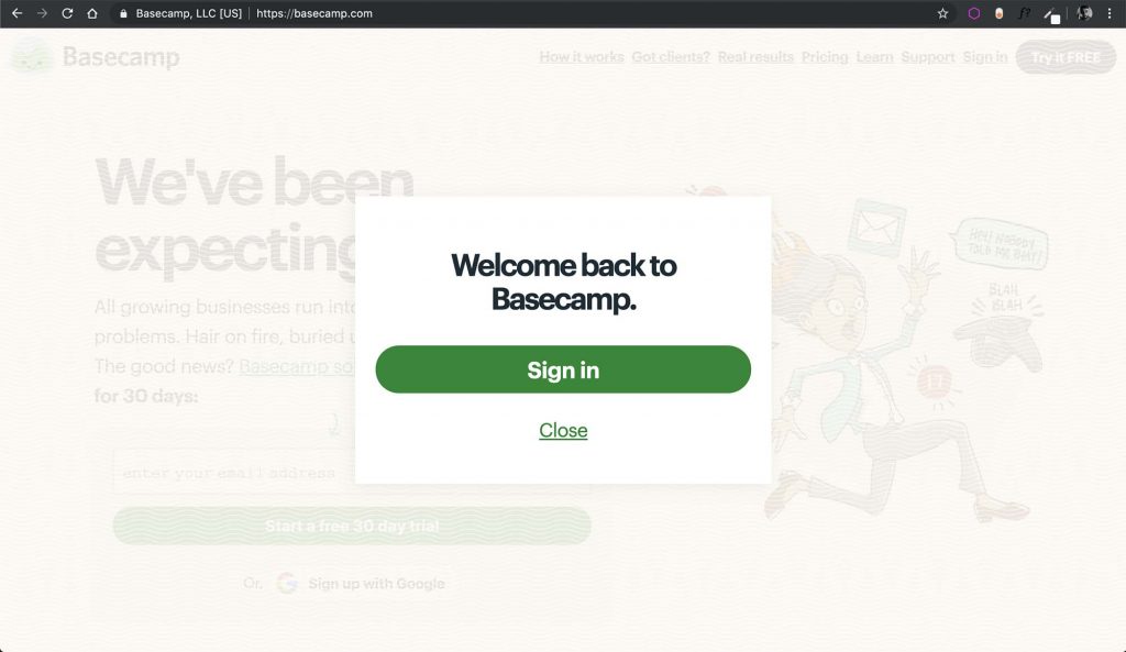
Later I’ll tackle that with Basecamp’s example.

Where did this idea come from?
If you’ve ever used Google/Facebook ads, you probably know where this comes from. For those who don’t, the brief explanation is that it traditionally works like this:
- You create a couple of audiences that you think are relevant to what you’re doing
- You create something relevant and valuable to them. But this is not the “sign up to get this ebook” kind of bullshit. It could be something of actual help where you “lose money” on the ad.
- A/B test these audiences until you see what works better
- You “retarget” these audiences with the something you sell. Maybe it’s now that you ask them to download your eBook, if you want to play the long game, or maybe you’re going straight for the sale.
In practical terms that means this. Let’s say you’re selling a product that helps people clean/maintain their watch.
- You create these audiences. Audience 1 people have liked the Rolex page and are 30 to 45 and working in this city. Audience 2 have liked a watch influencer’s page and are 40 to 55. You end up with 30 audiences.
- You create a video that’s basically a YouTube tutorial about cleaning your watch. That works wonders in a Facebook/Instagram feed since it’s “masked”— harder to tell whether it’s from a page you liked or an actual ad (as opposed to “BUY NOW” which is definitely an ad). People don’t get buyer’s resistance as you’re not selling something to them.
- These 30 audiences are A/B tested and then the top 5 audiences are picked (i.e. those 5 audiences that watched the most out of the video and/or engaged with a comment like etc).
- You run an ad now that actually sells your kit/product to those who have watched more than 60% of the video (i.e. “converted” in terms of video watch time)
This is the idea in short. Now, when it comes to how a SaaS company/startup presents itself, there’s no difference between what’s shown to a new user and one that’s more engaged with the product. It’s like comparing what I’ve just described above to a newspaper ad —the same thing is shown to everyone, regardless of their interaction level.
I’m proposing changing what’s shown to people based on a simple delimitation: whether they converted or not.

This idea, taken even further
Now that I’ve given this context from the advertising world, I can go even further. What if within your product you’ve got multiple audiences?
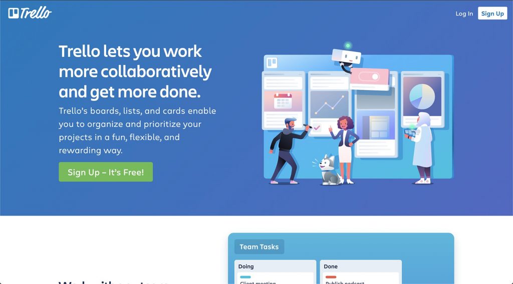
Say Trello. Trello can be used by people who are:
- Into project management and working with their teams
- People who use it for their life, as they are organised.
And within category 1, we’ve got the startup kind of team that’s just starting out and the more professional company — we can go and on with naming audiences.
How about a point along the onboarding process where these users place themselves into an audience pigeonhole?
And then based on which audience they are, they’ll have different versions of the homepage website (not the app!), should they ever go there? If not the homepage, then whatever page they have to go through before cancelling the payment.
And that’s not to hold them as hostages (that’s another thing I believe in) — rather something that’s there to remind them about the value delivery either before they unsubscribe or when they happen to visit that page.
Is this happening already?
Since I’ve mentioned Trello, their homepage takes you to their app, if you’re logged in, or to their landing page if you’re not. Different behaviours based on the conversion level of the user.
Basecamp shows this pop-up if you’re logged in.
All social media platforms look one way if you’re logged in as opposed to not being logged in.
If it can be done at that level, that doesn’t stop you or I from doing it for our SaaS subscribers.
Can my idea be implemented? Yes, but it’s not easy. However, it’s definitely a way for companies to increase their bottom line, especially if their user churn rate is higher than it should be.
About Ch Daniel
I run Chagency_, an experiences design agency — we help SaaS CEOs reduce user churn. I write daily on this topic and in similar areas. Here are my best pieces.
If I’ve helped you, follow me here and reach out: LinkedIn | Twitter | Email | Quora | YouTube
I’ve also founded an app (among others) that has got 6 digits in # of users — chdaniel.com/app
If you want a more of a personal connection, here’s how to have that.